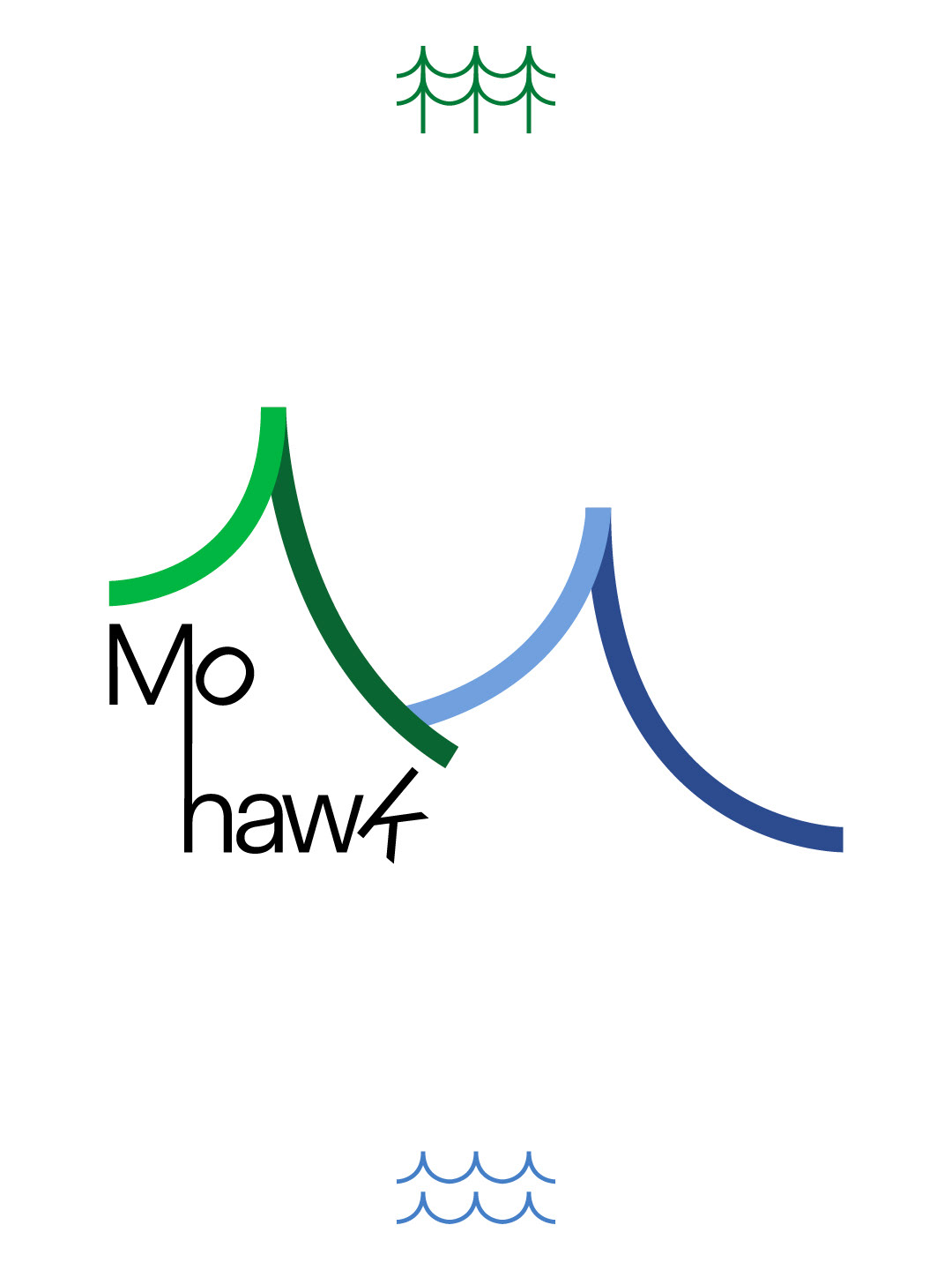
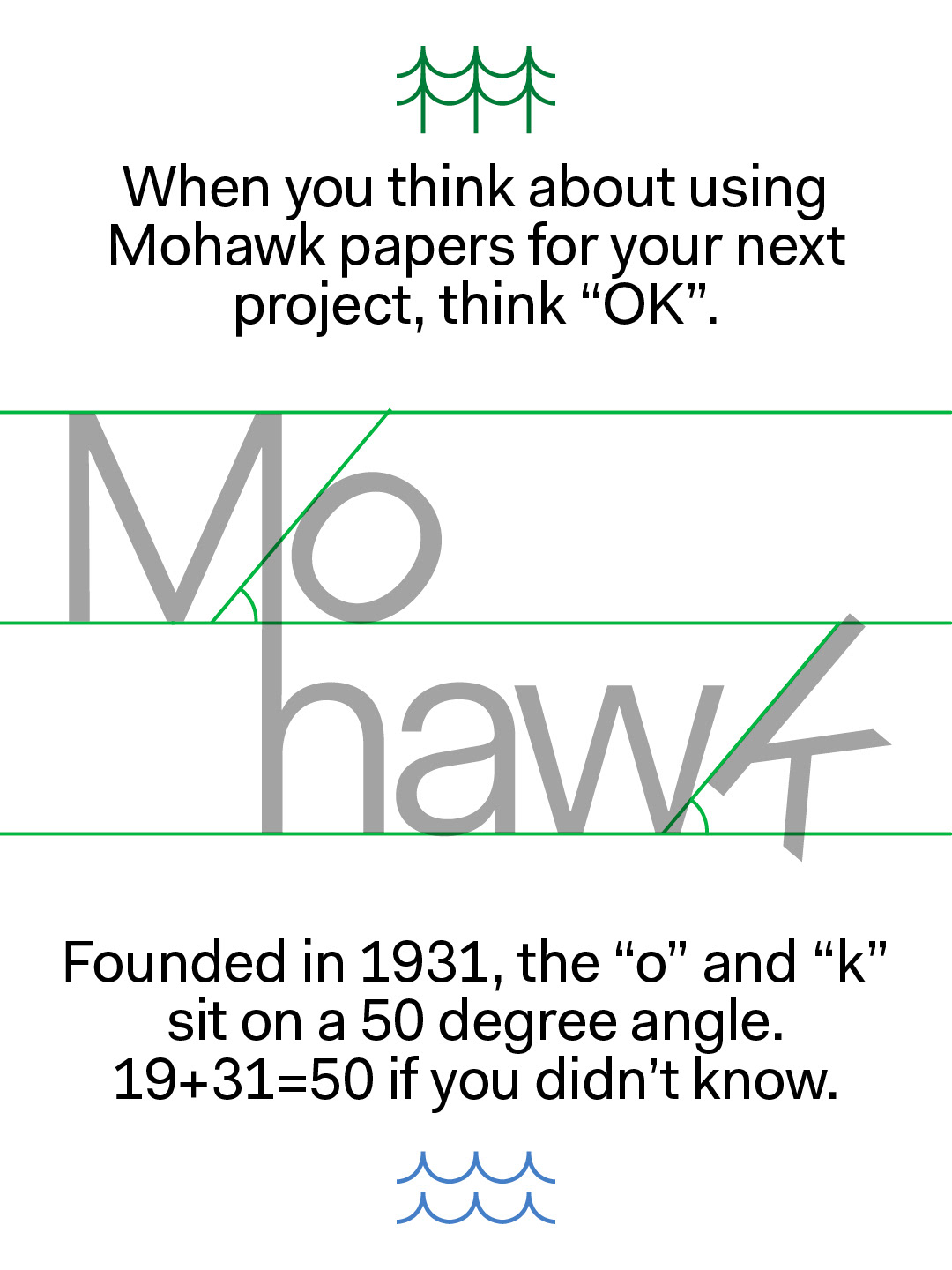
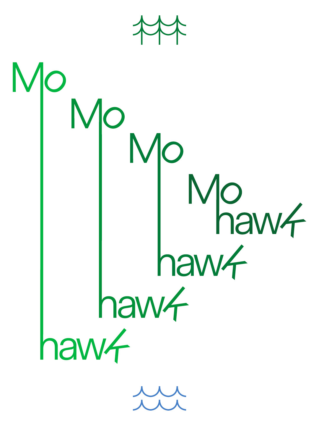
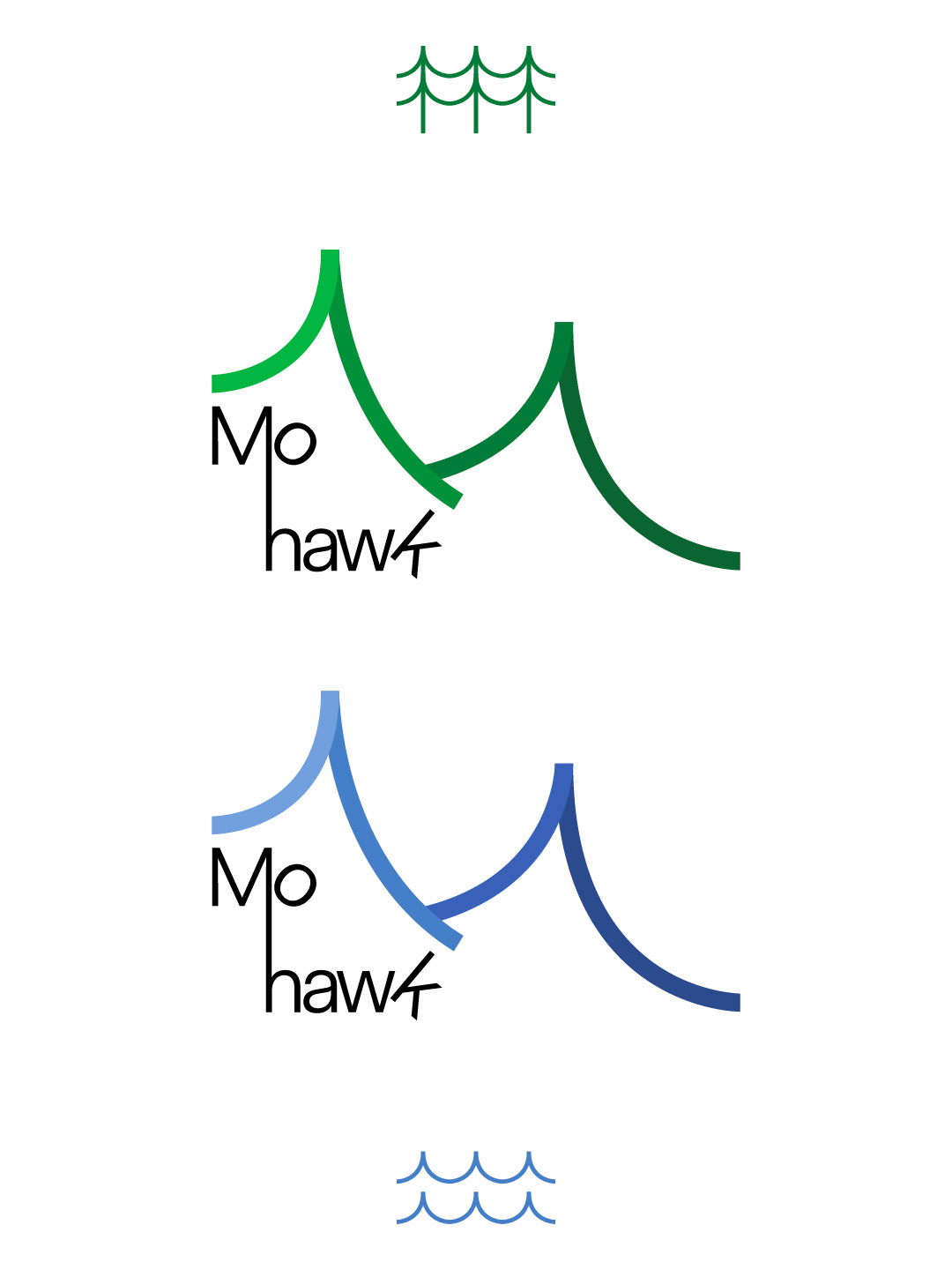
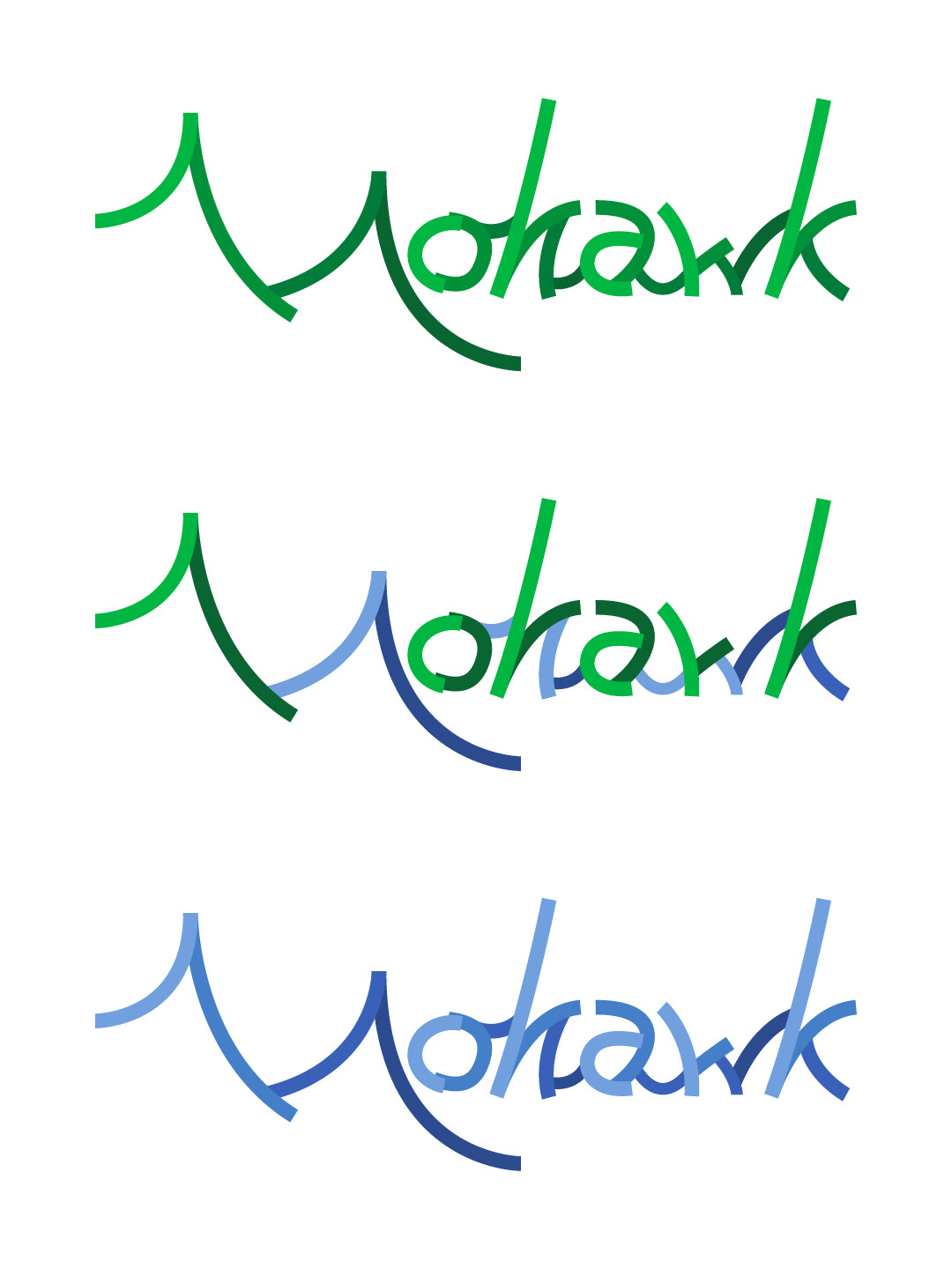
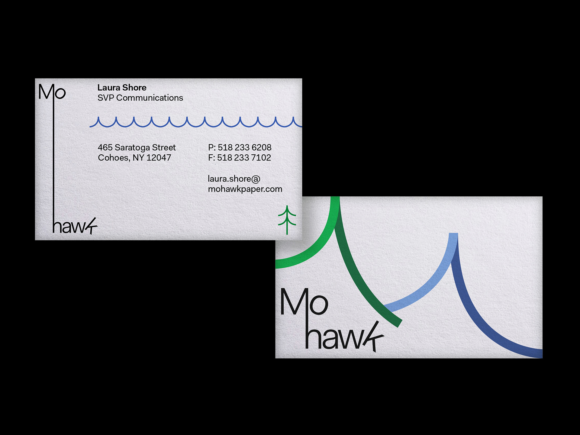
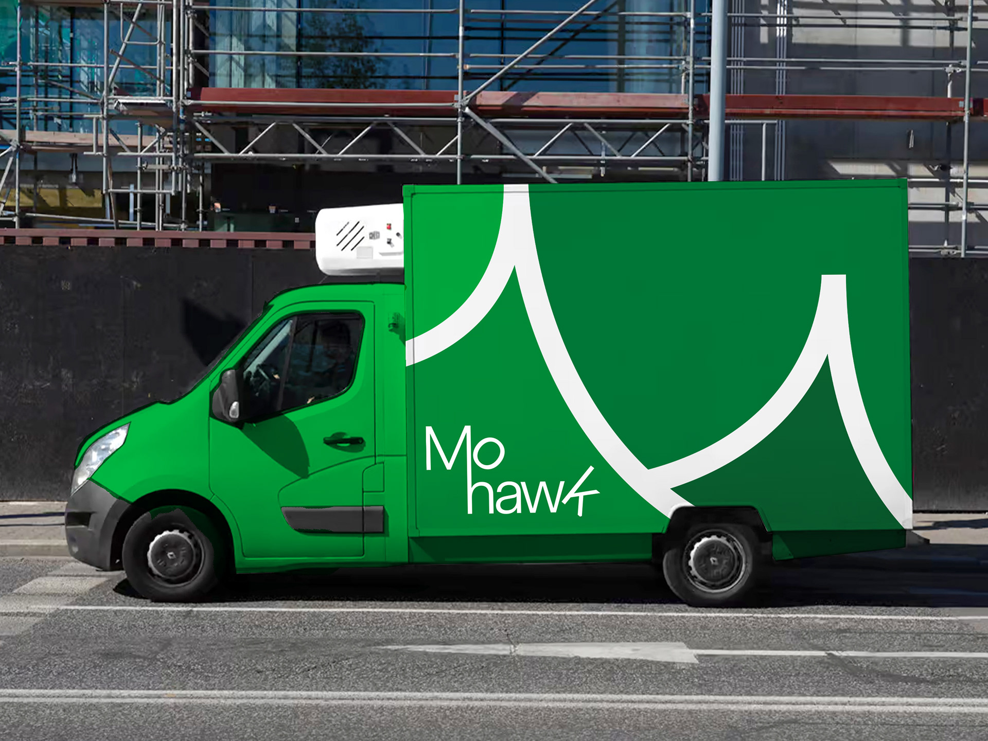
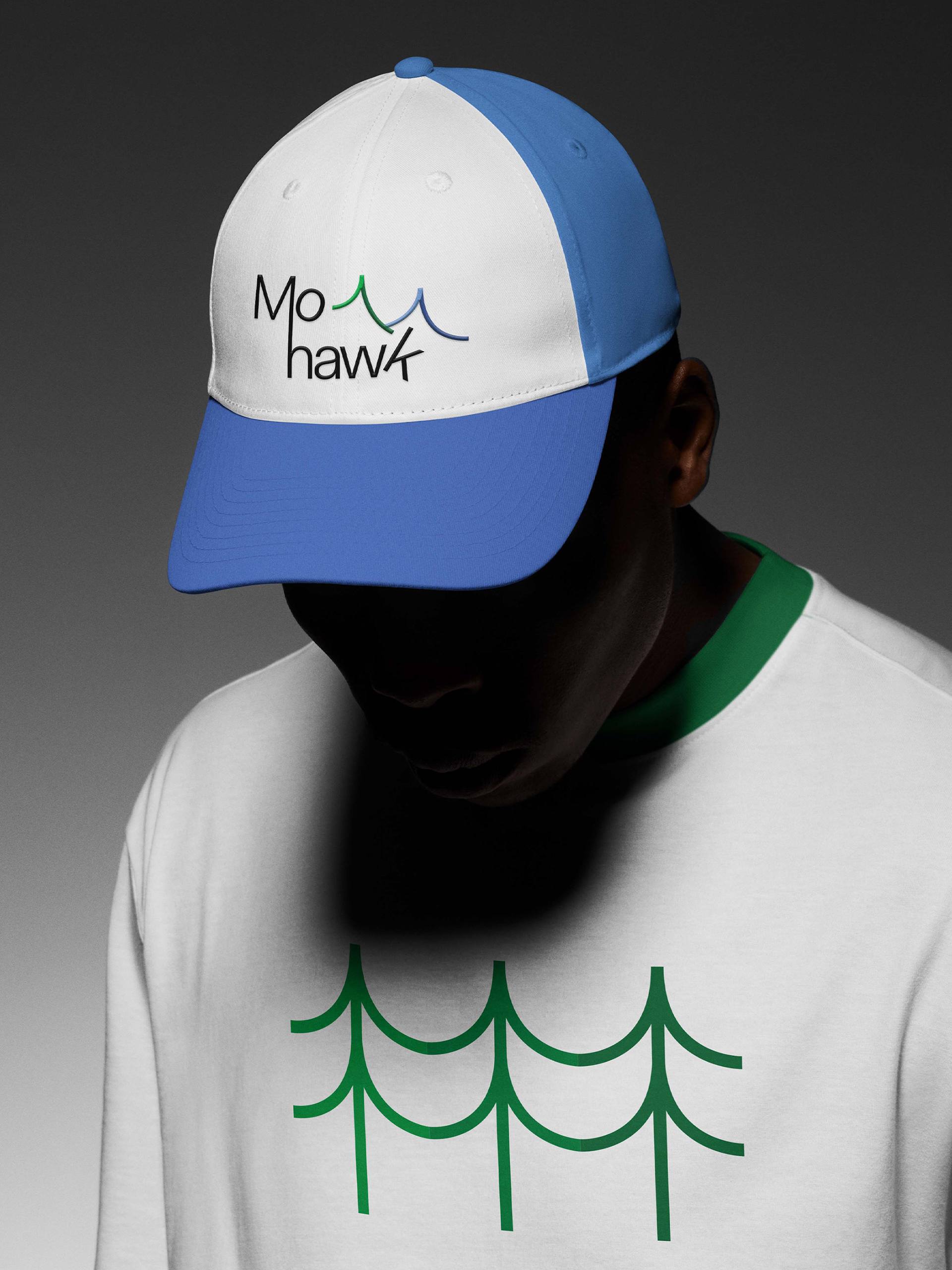
Mohawk Paper Brand Refresh—A hypothetical rebrand of a popular fine paper company inspired by sustainable production, natural beauty, and the patterns of rivers and paper.
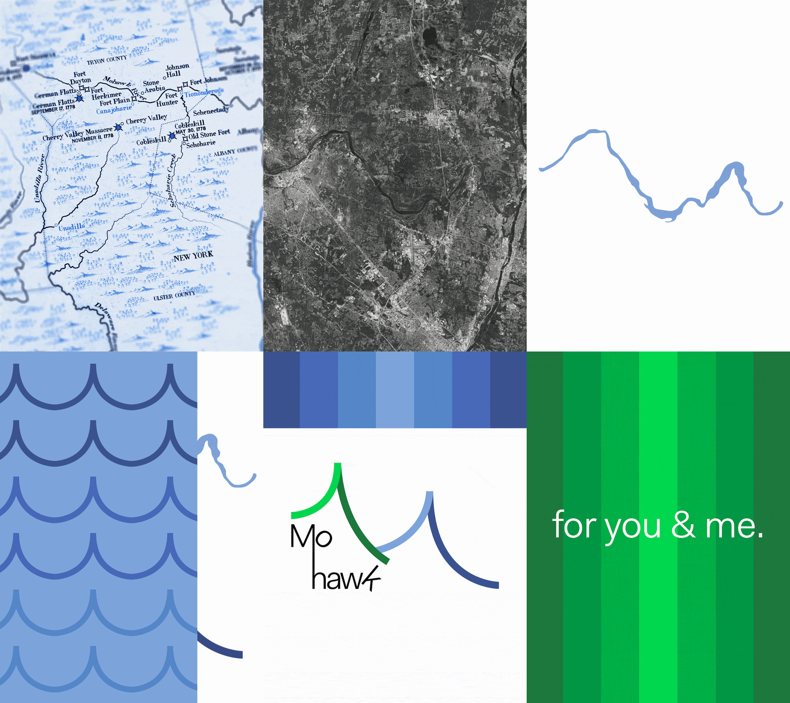
Initially assigned as a brand identity project for a Graphic Design course at RISD in 2025 instructed by Anther Kiley, over a year later I revisited my work to improve upon it.
I remember the numerous sustainability efforts and respect the paper company had for the land surrounding the Mohawk River and greater Mohawk Valley area, so from the beginning I wished to emphasize the effortless beauty of nature that is the basis for all creative works.
I was drawn to the rhythms of nature, flowing rivers, rows of trees with winding roots, and rolling mountains. Made from natural fibers, I felt that paper contained many of these same rhythms in the form of its grains, spirals, folds, and rips. Just like nature, paper contains the potential to be both a miraculous work or devastating disaster, depending on how we treat it.
I was drawn to the rhythms of nature, flowing rivers, rows of trees with winding roots, and rolling mountains. Made from natural fibers, I felt that paper contained many of these same rhythms in the form of its grains, spirals, folds, and rips. Just like nature, paper contains the potential to be both a miraculous work or devastating disaster, depending on how we treat it.