Ivy Film Festival 2025—Art direction with a consideration for the annual refresh of branding, social media graphics, illustration, and merchandise design.

For my second year on the Branding Team of Ivy Film Festival, the world's largest student-run film festival, I took on the role of Branding Coordinator and planned to make the 2025 season even better than the last.
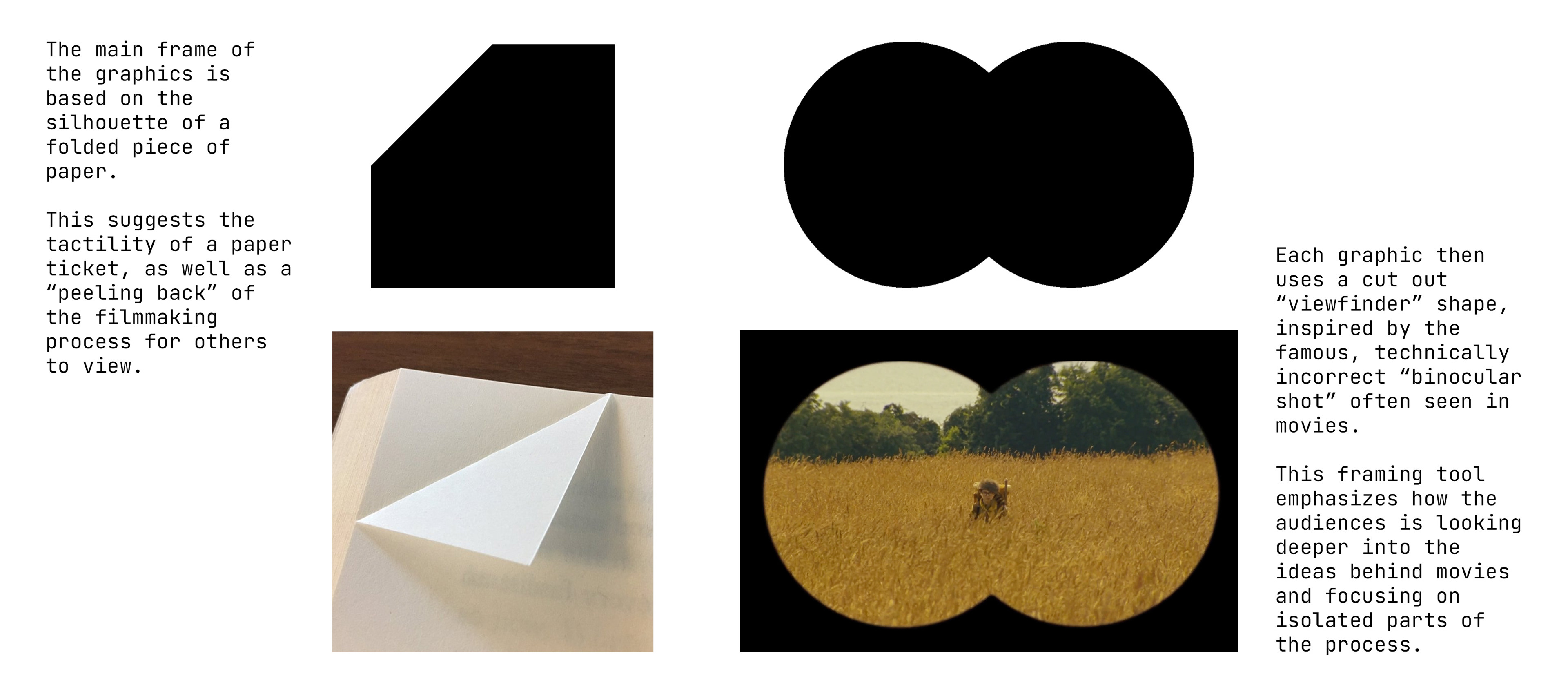
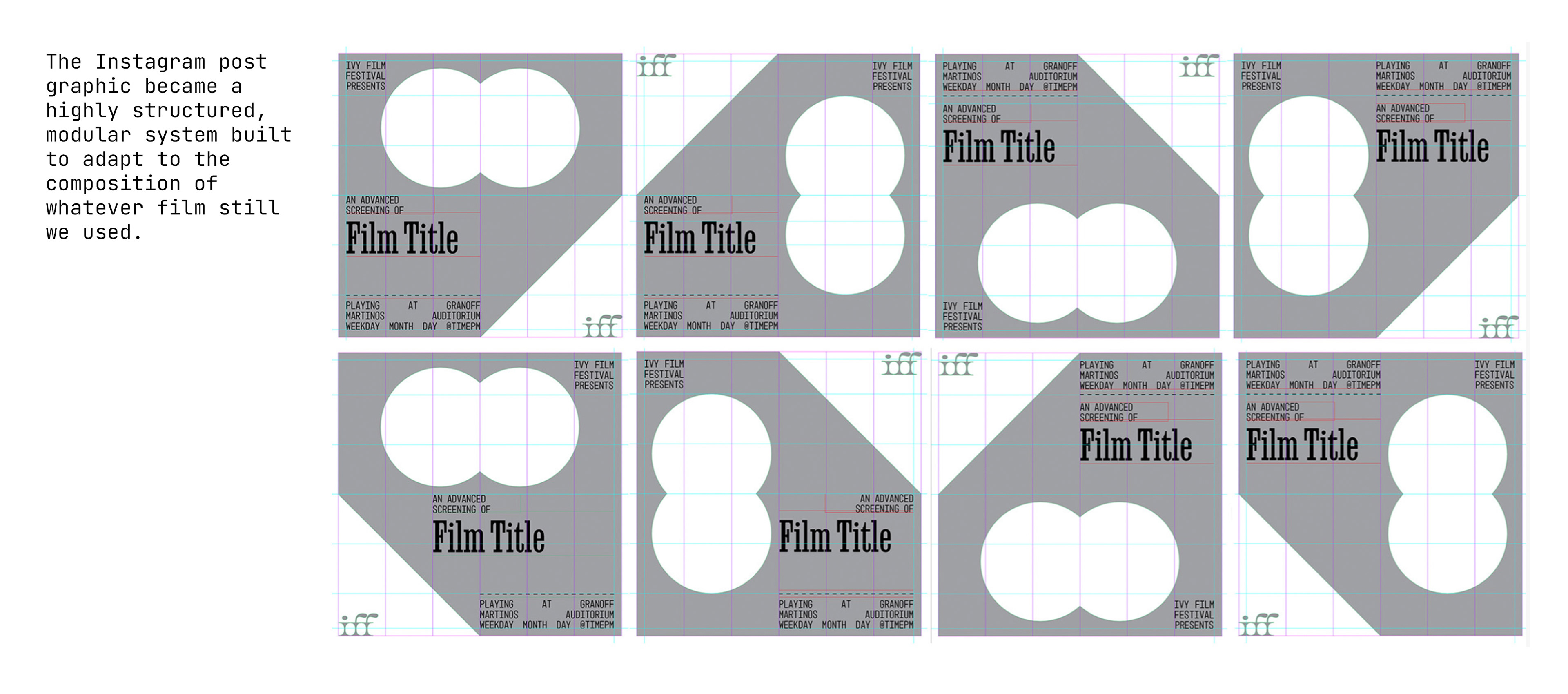
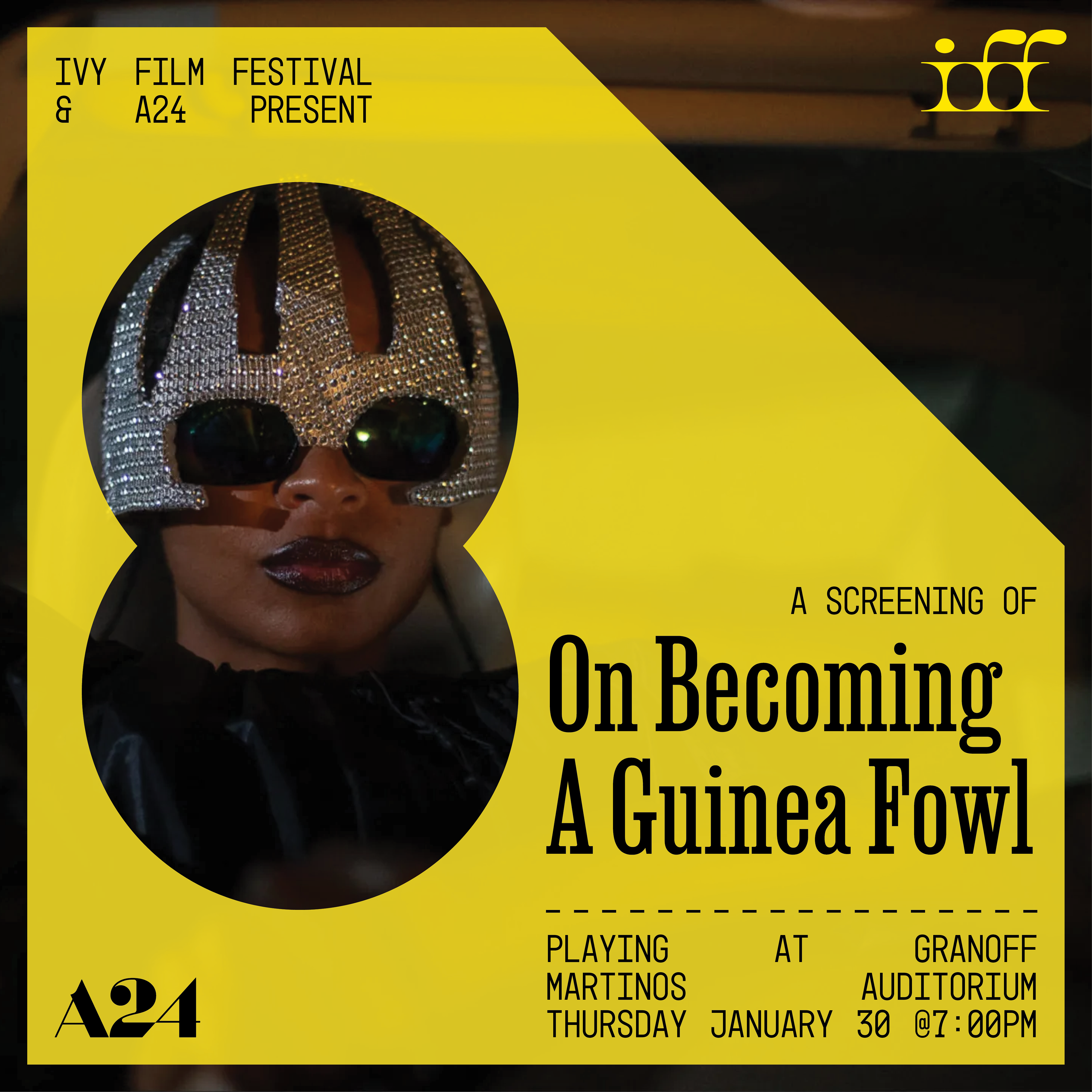
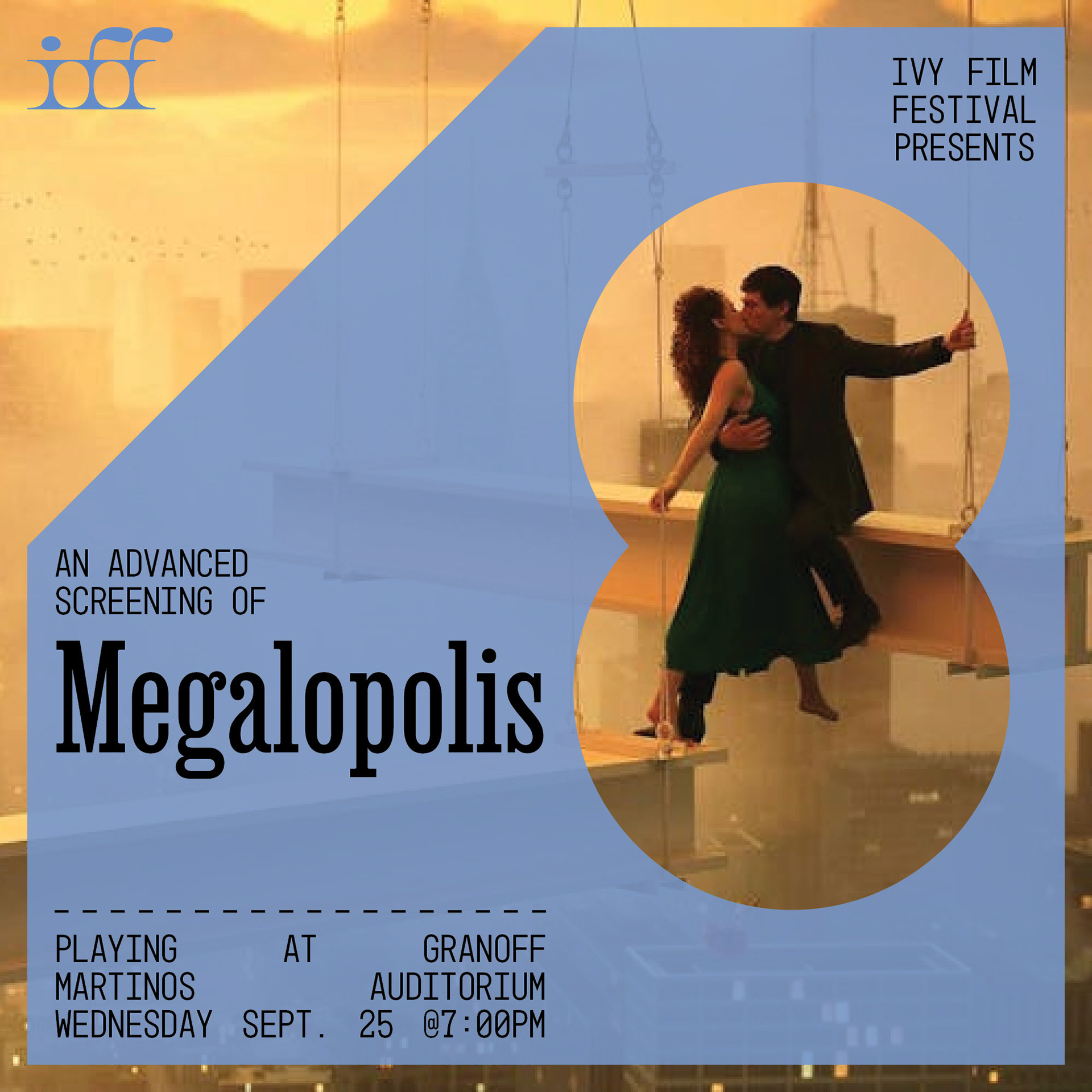
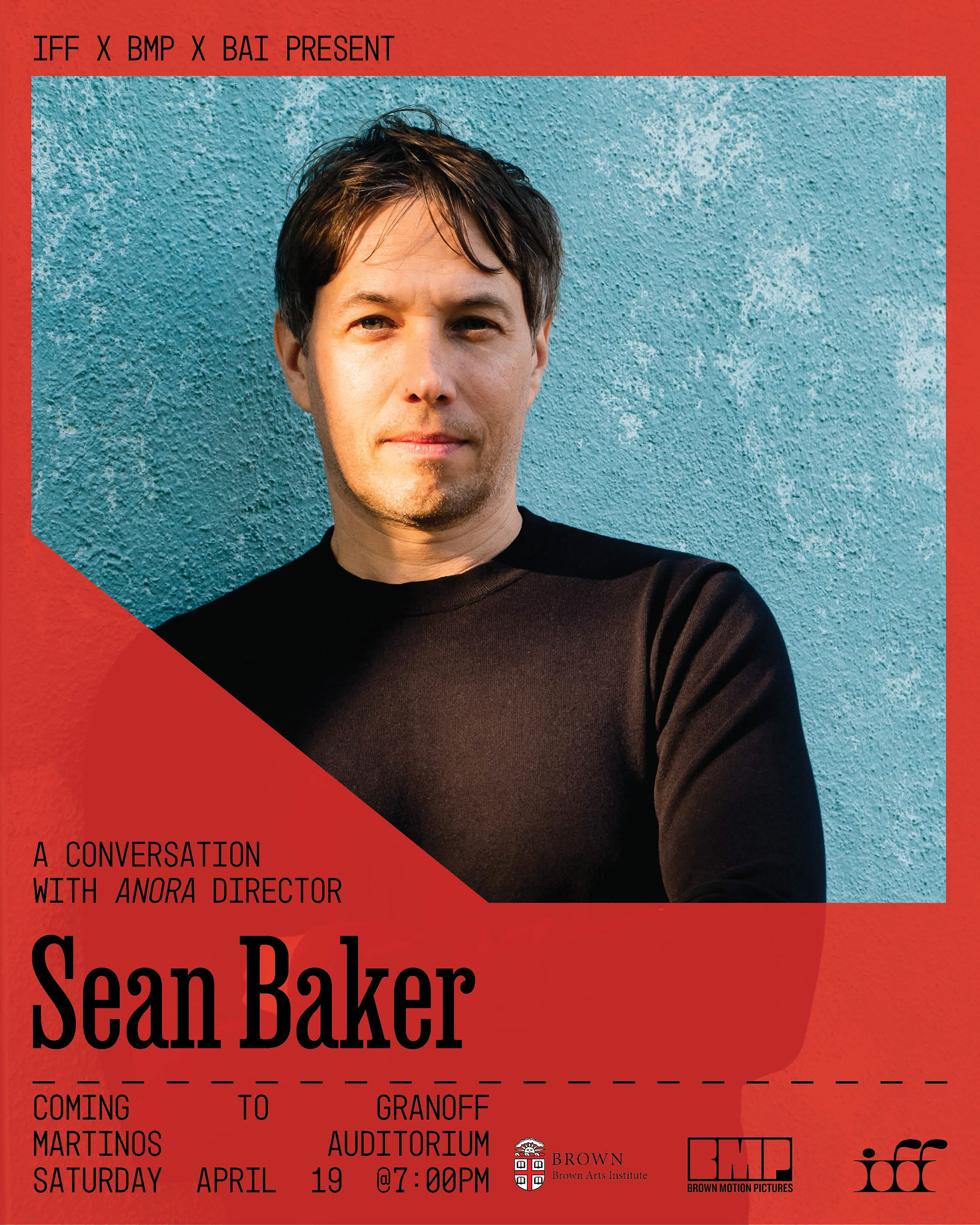
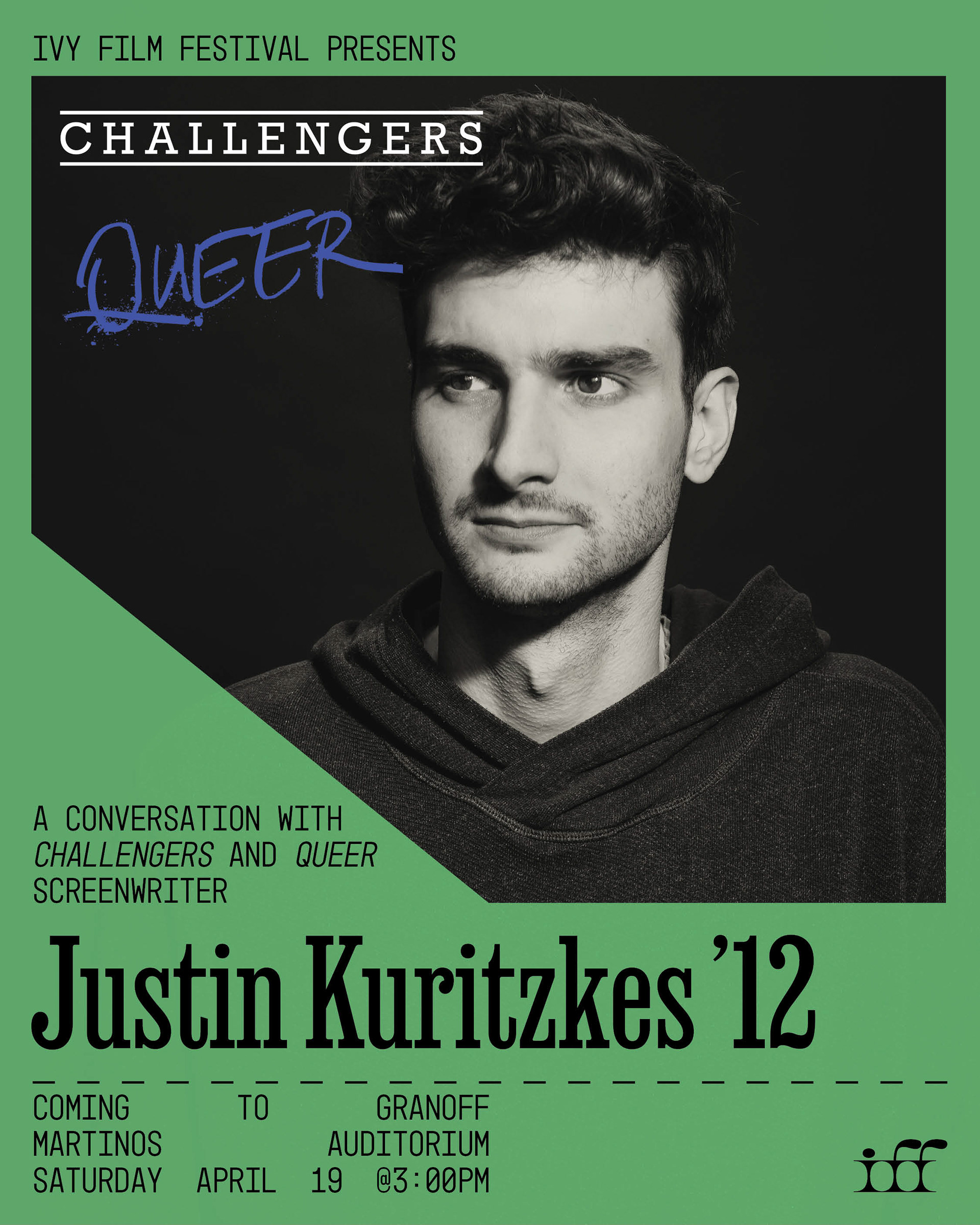
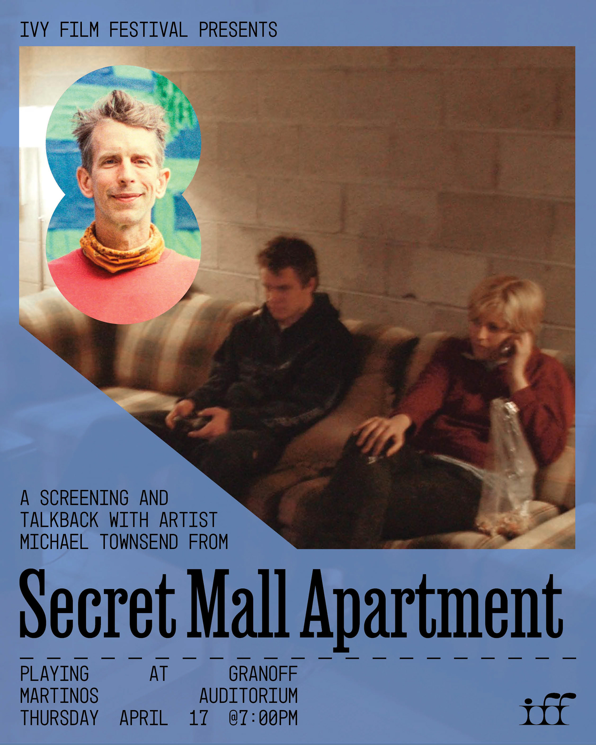
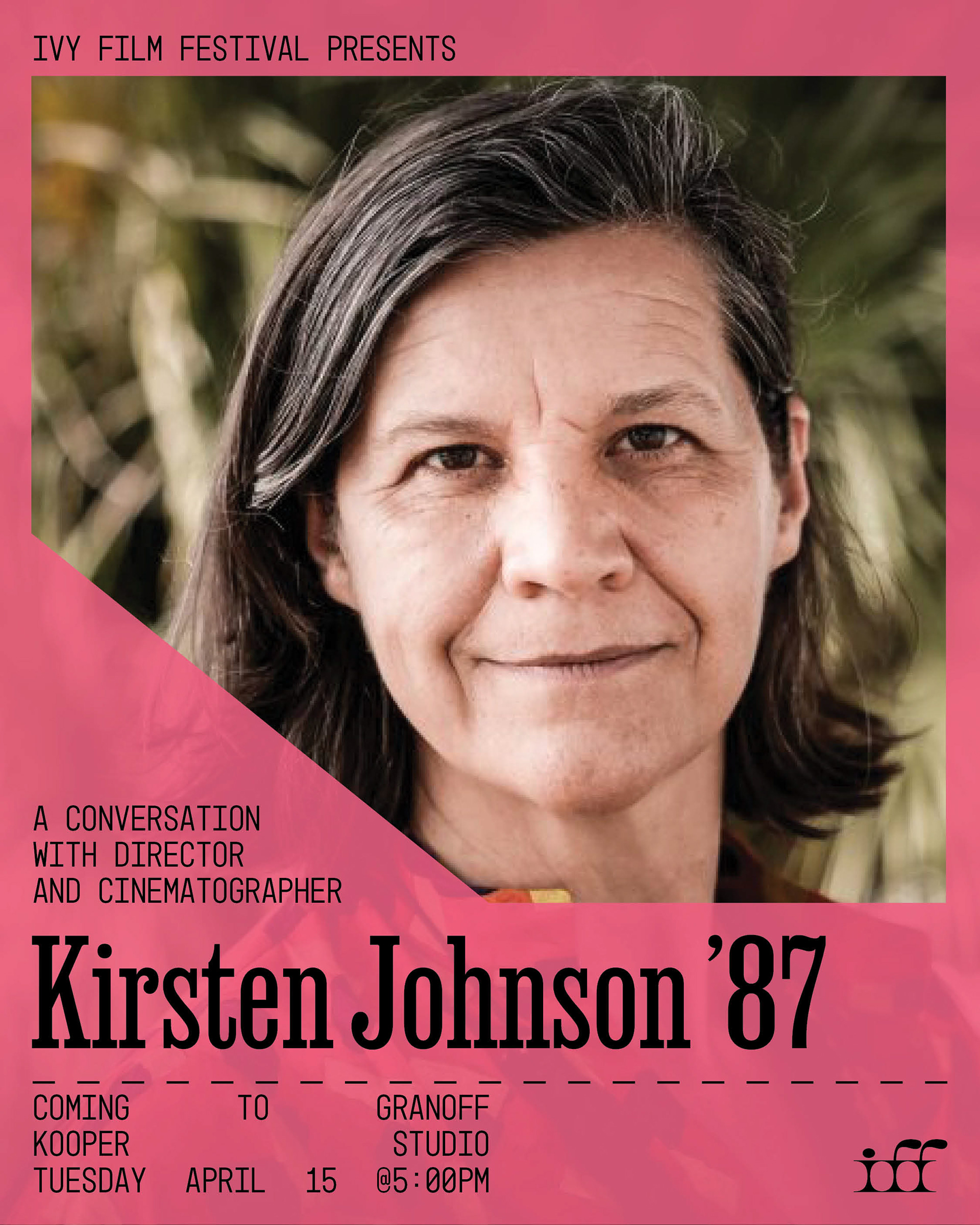
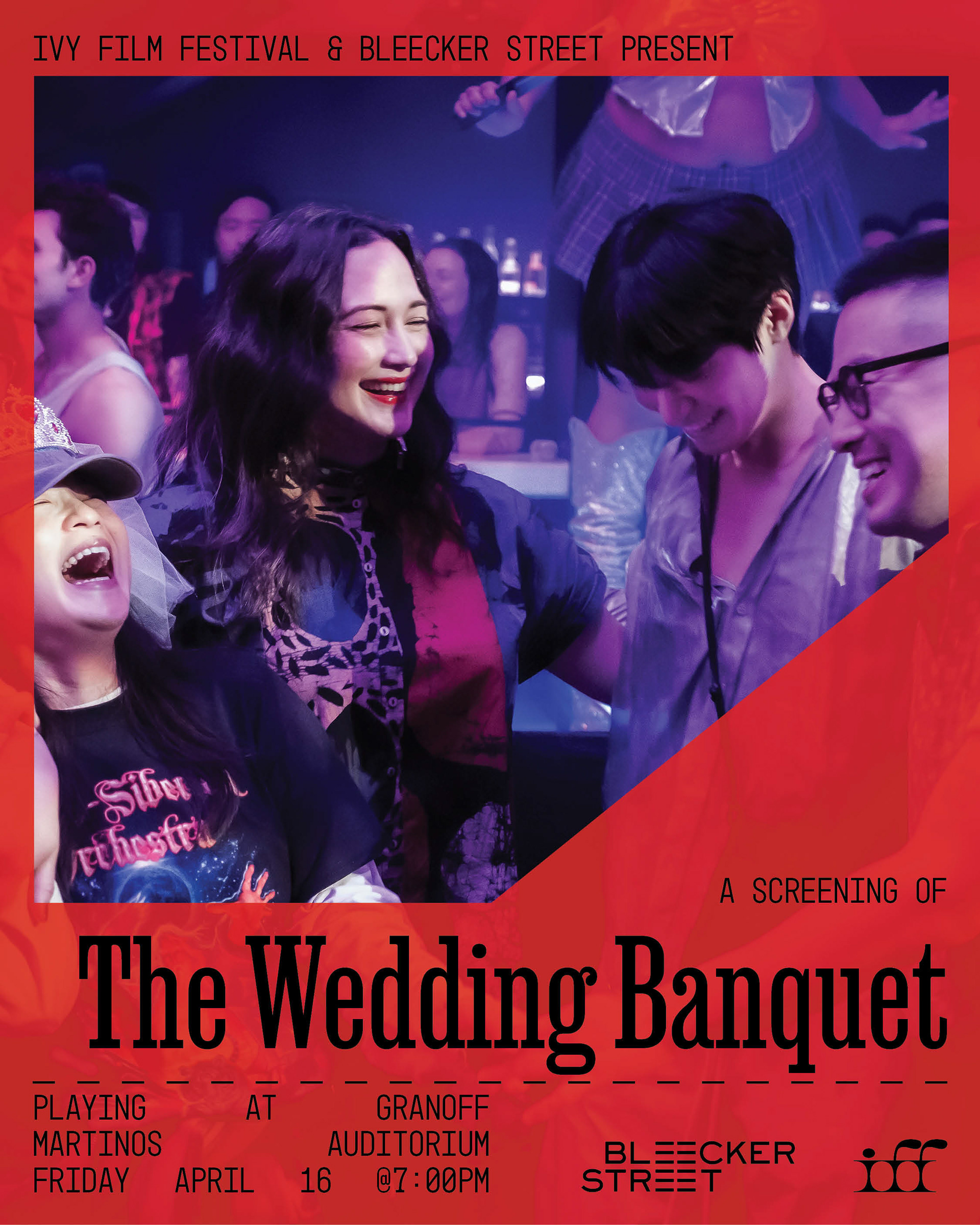
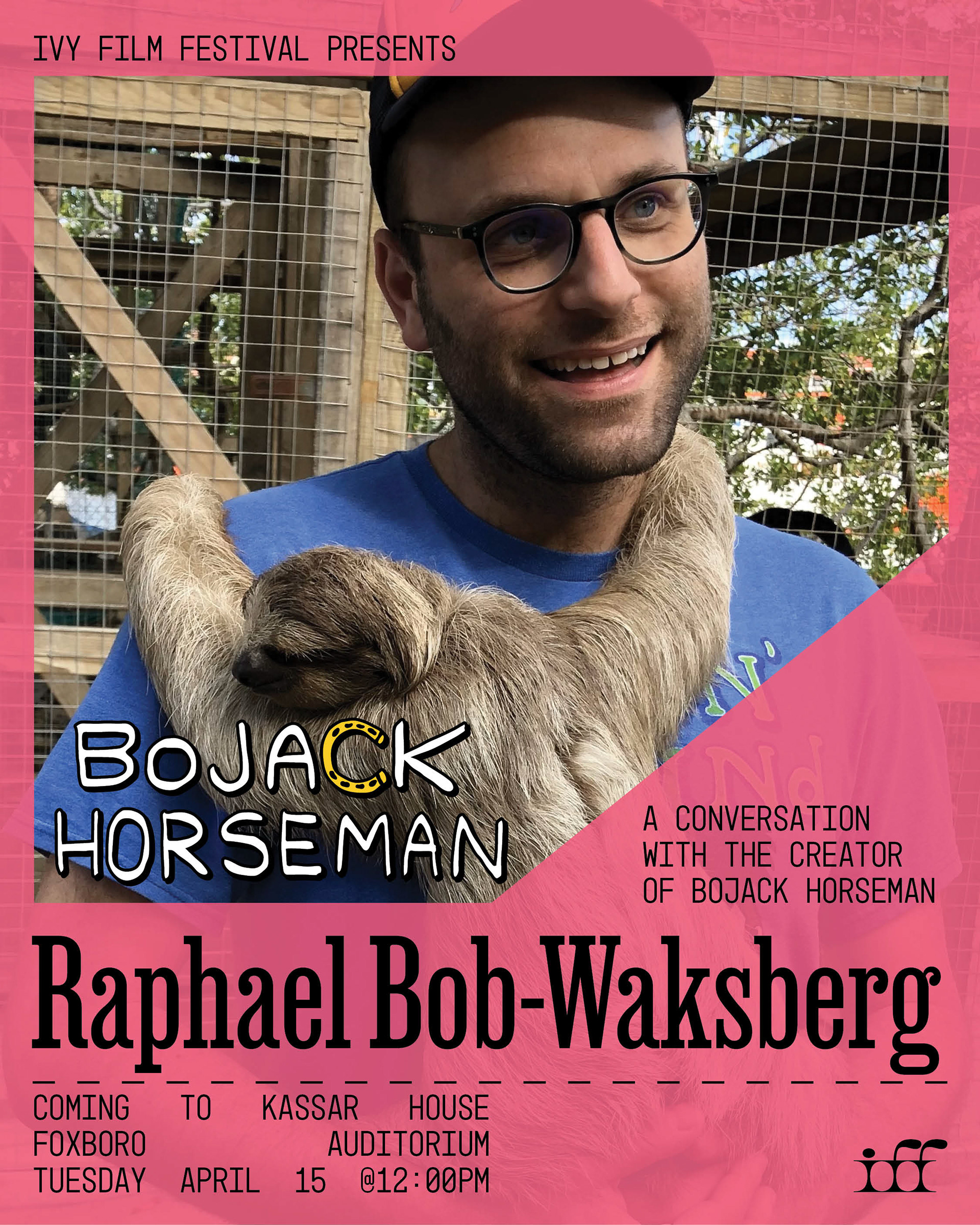
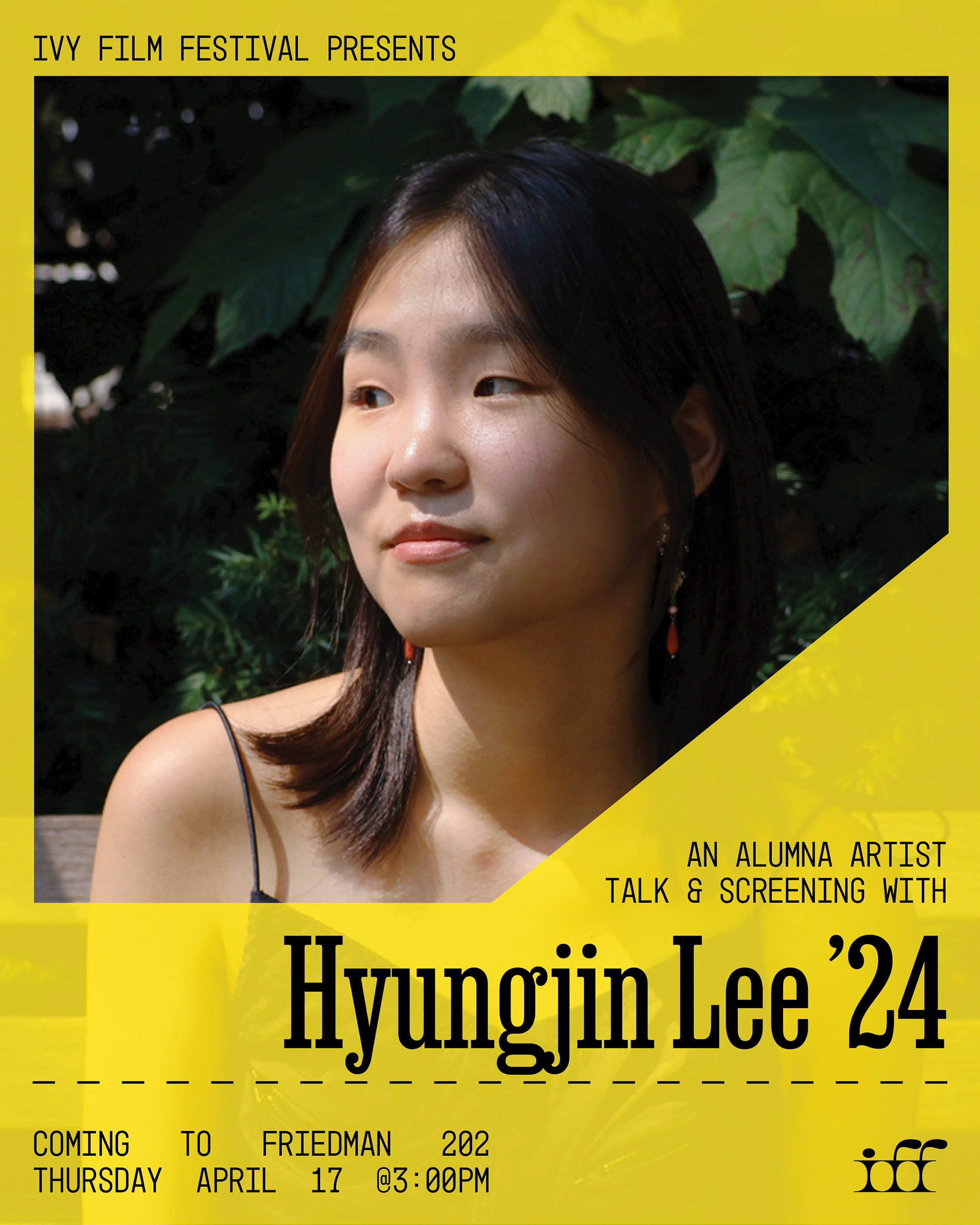
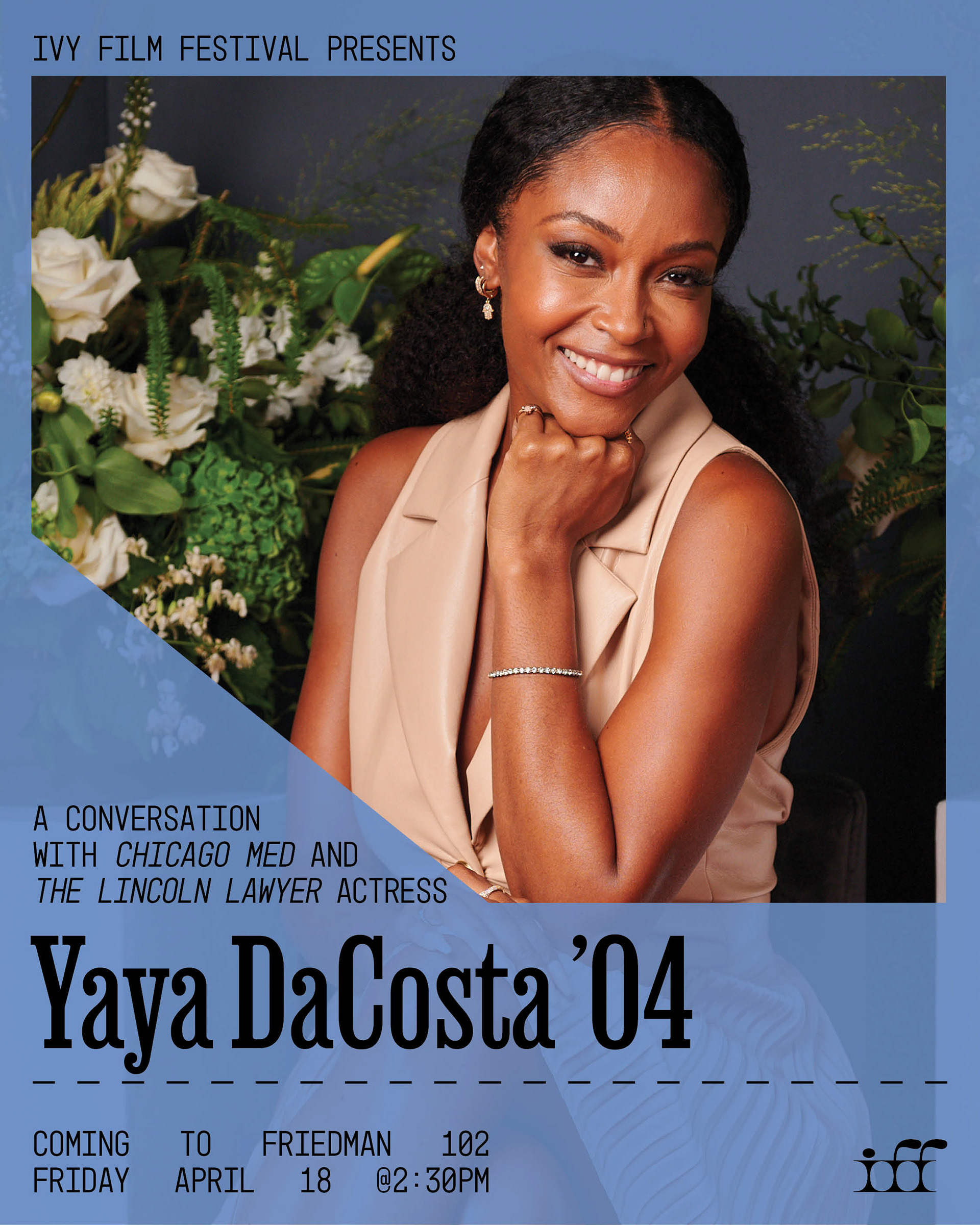
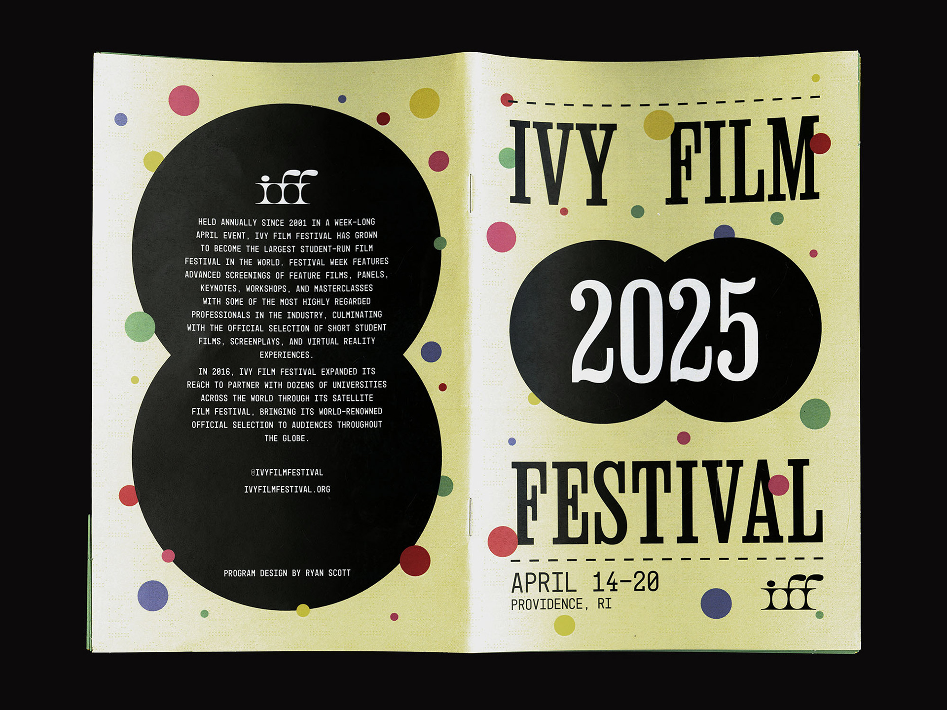
Starting in the Fall, weekly meetings with our team outlined our identity for the season. We were inspired by the translucent nature of thin paper and perforated edges of movie tickets as visual motifs to draw from. This inspiration continued into our typefaces as we chose a mono spaced font that looked like something you would see on a ticket stub. Bold, condensed serif text became our main typeface choice and continued to point to a retro look that we could play with to appear timeless.
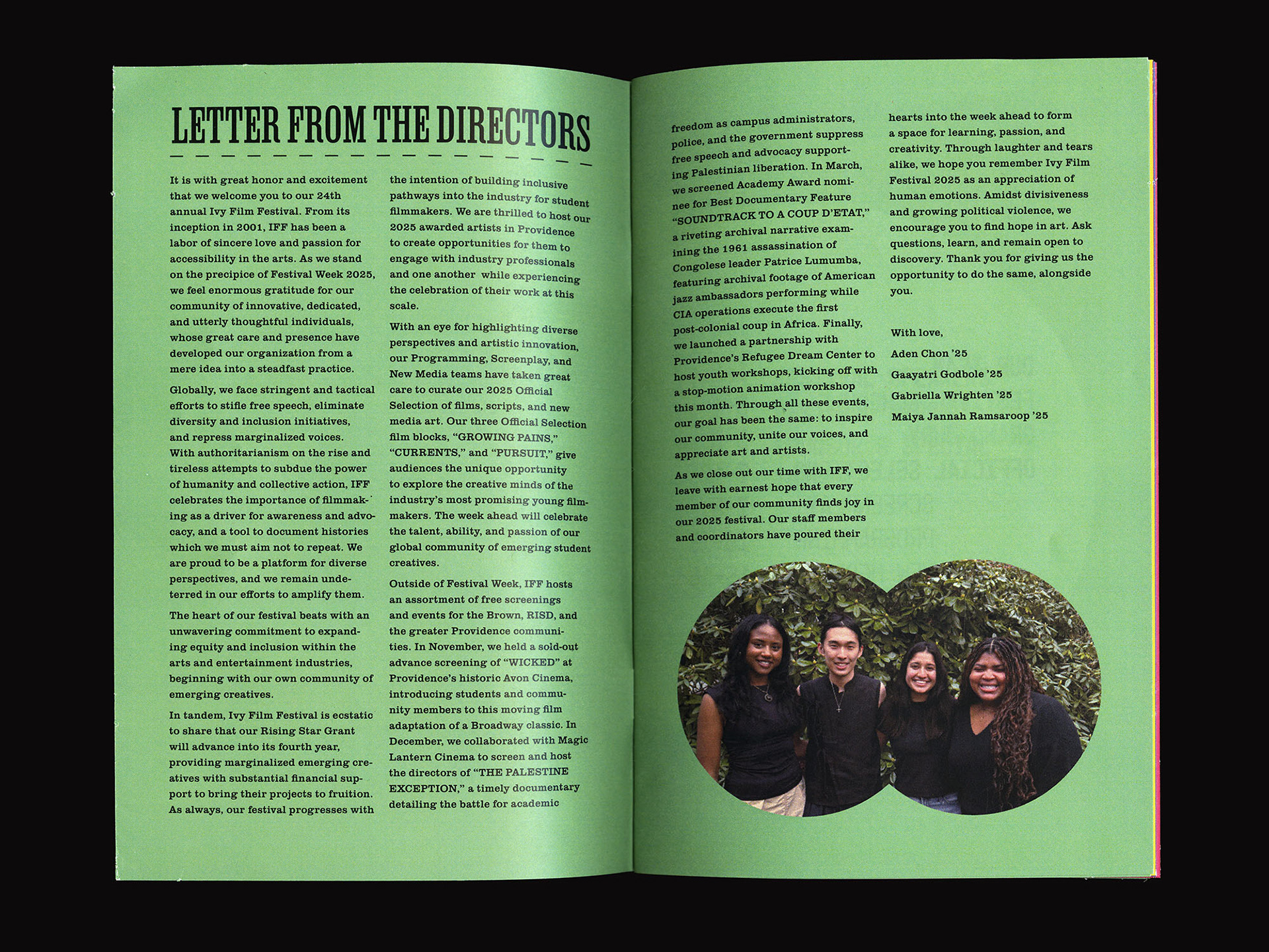
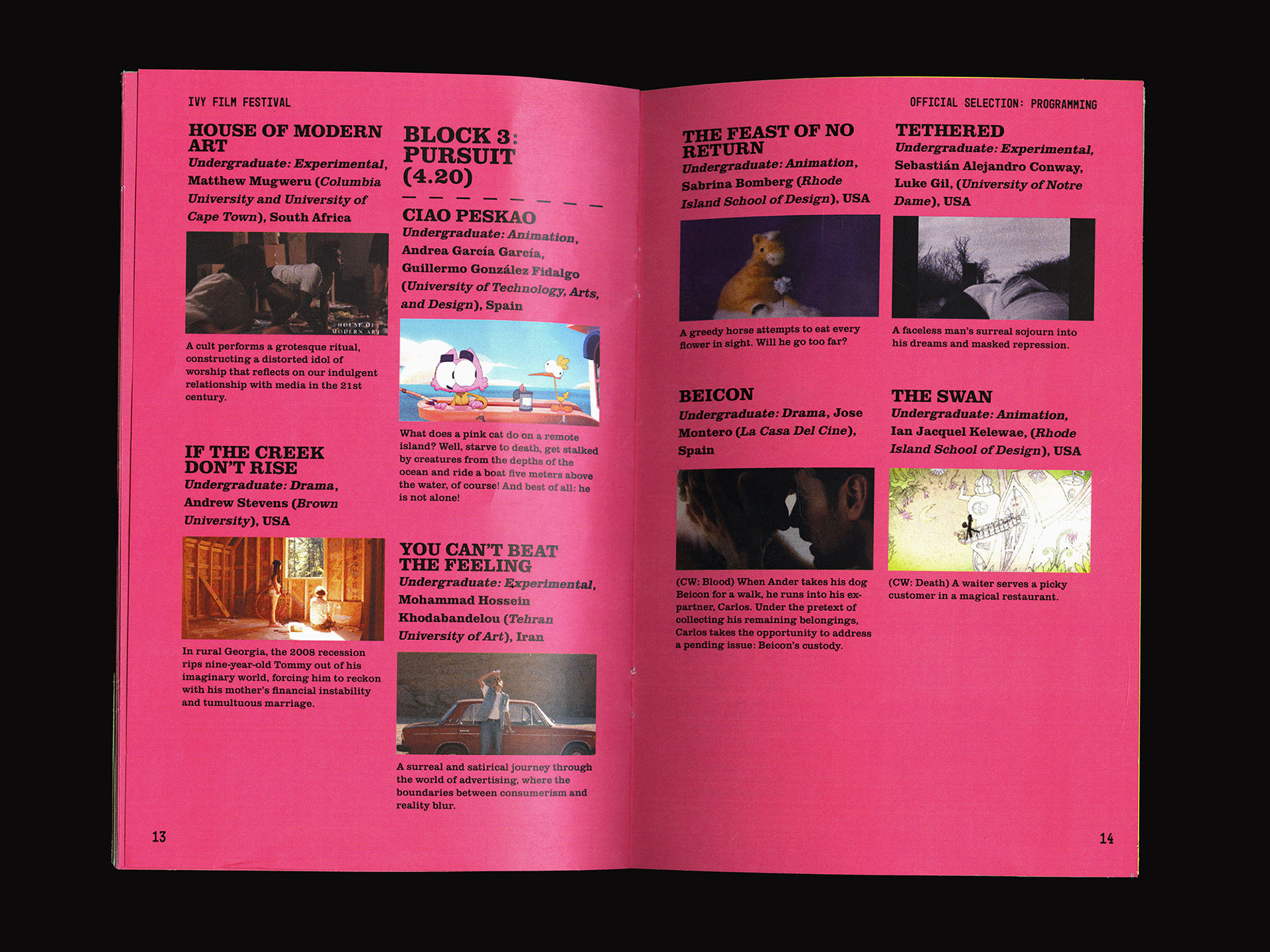
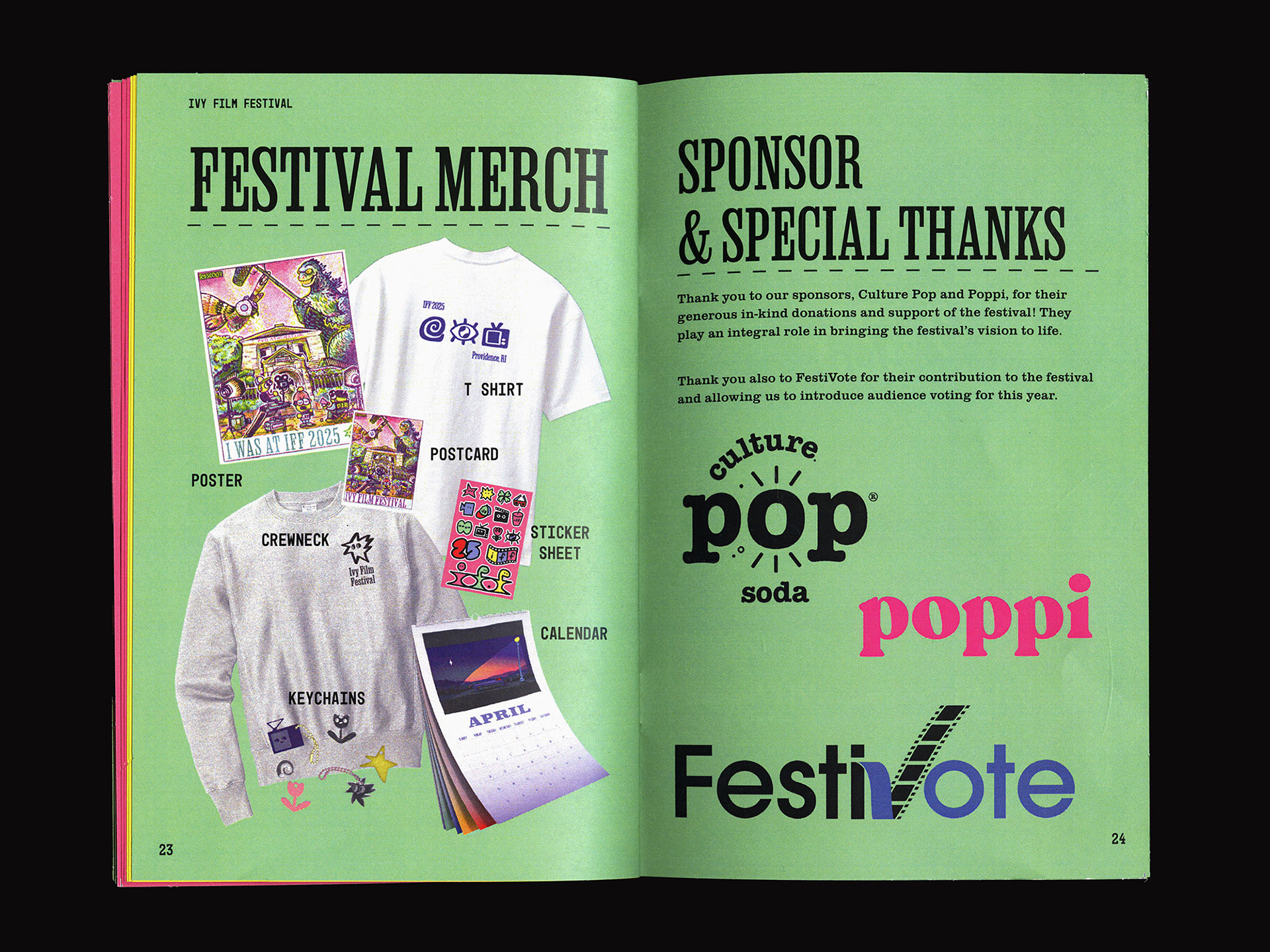
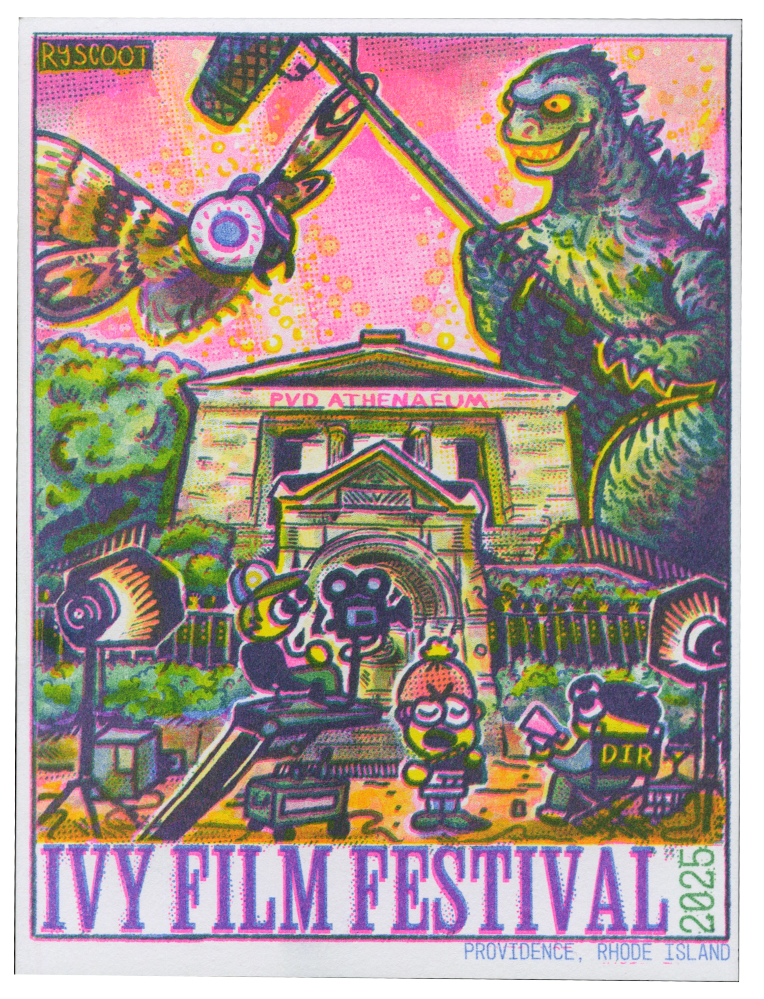
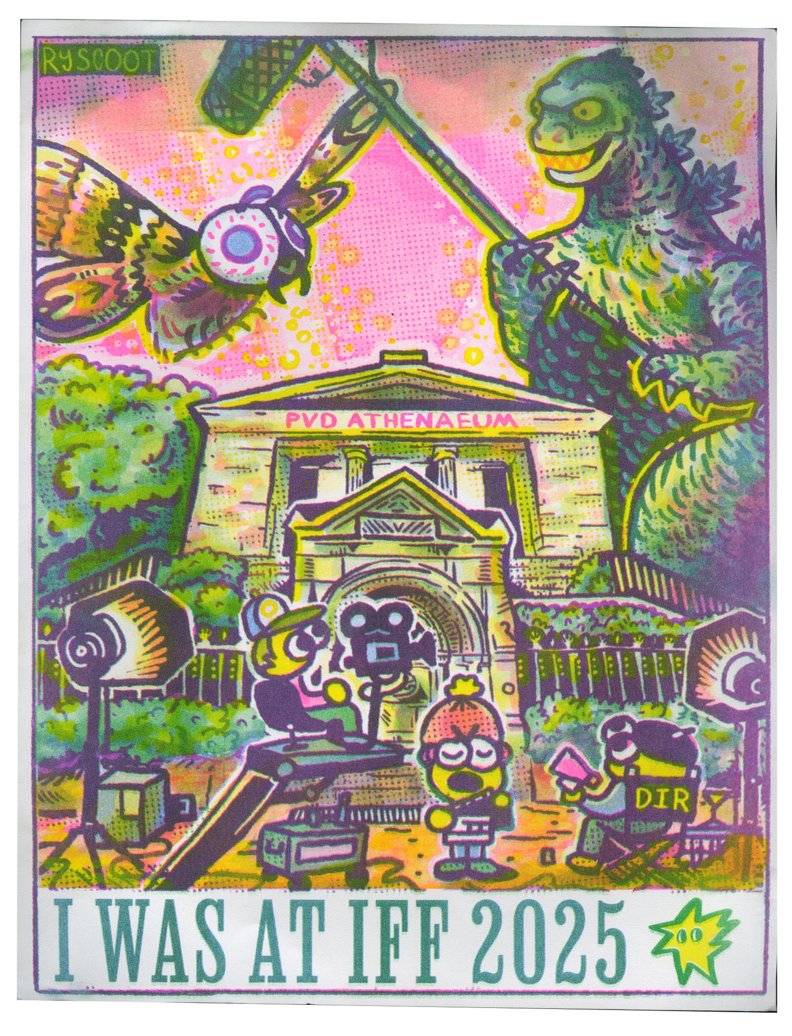
Additionally, I illustrated a risograph printed postcard and poster as well as the program given out to audience members during festival week in April.