For this project on how power is communicated through design, I focused on a rural landmark that I’ve seen around my hometown for years and still don’t full understand its origin.
Usually seen in front of farms owned and operated by conservative Mennonite families, these wooden mailbox signs feature typical Bible verses and common Christian sayings in a way that almost feels like ‘rustic billboards’.
Usually seen in front of farms owned and operated by conservative Mennonite families, these wooden mailbox signs feature typical Bible verses and common Christian sayings in a way that almost feels like ‘rustic billboards’.
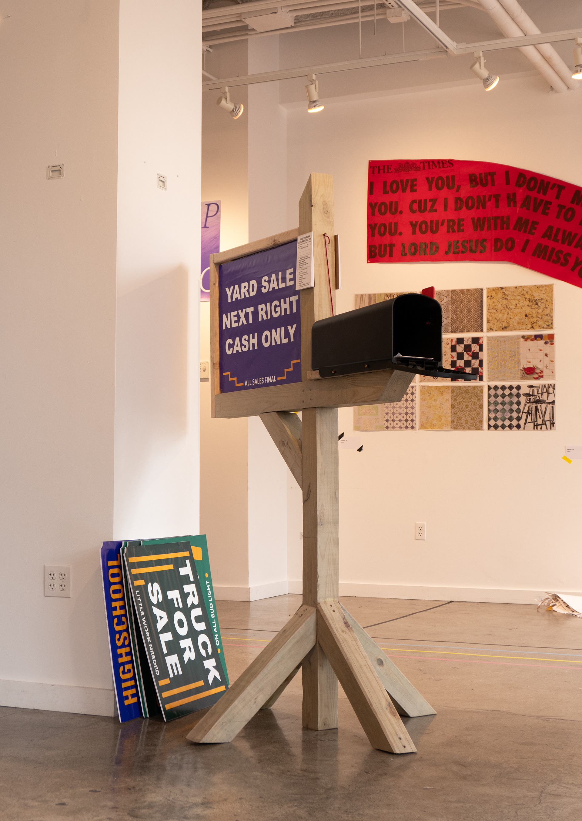
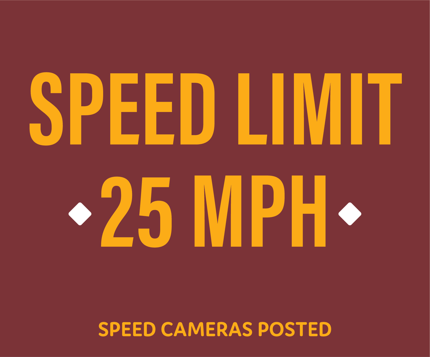
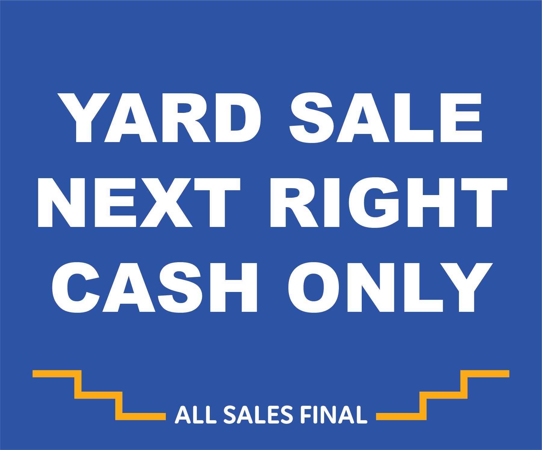
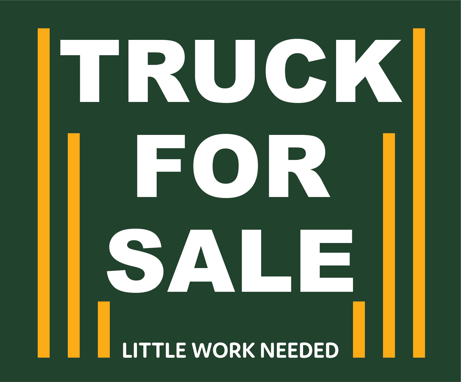
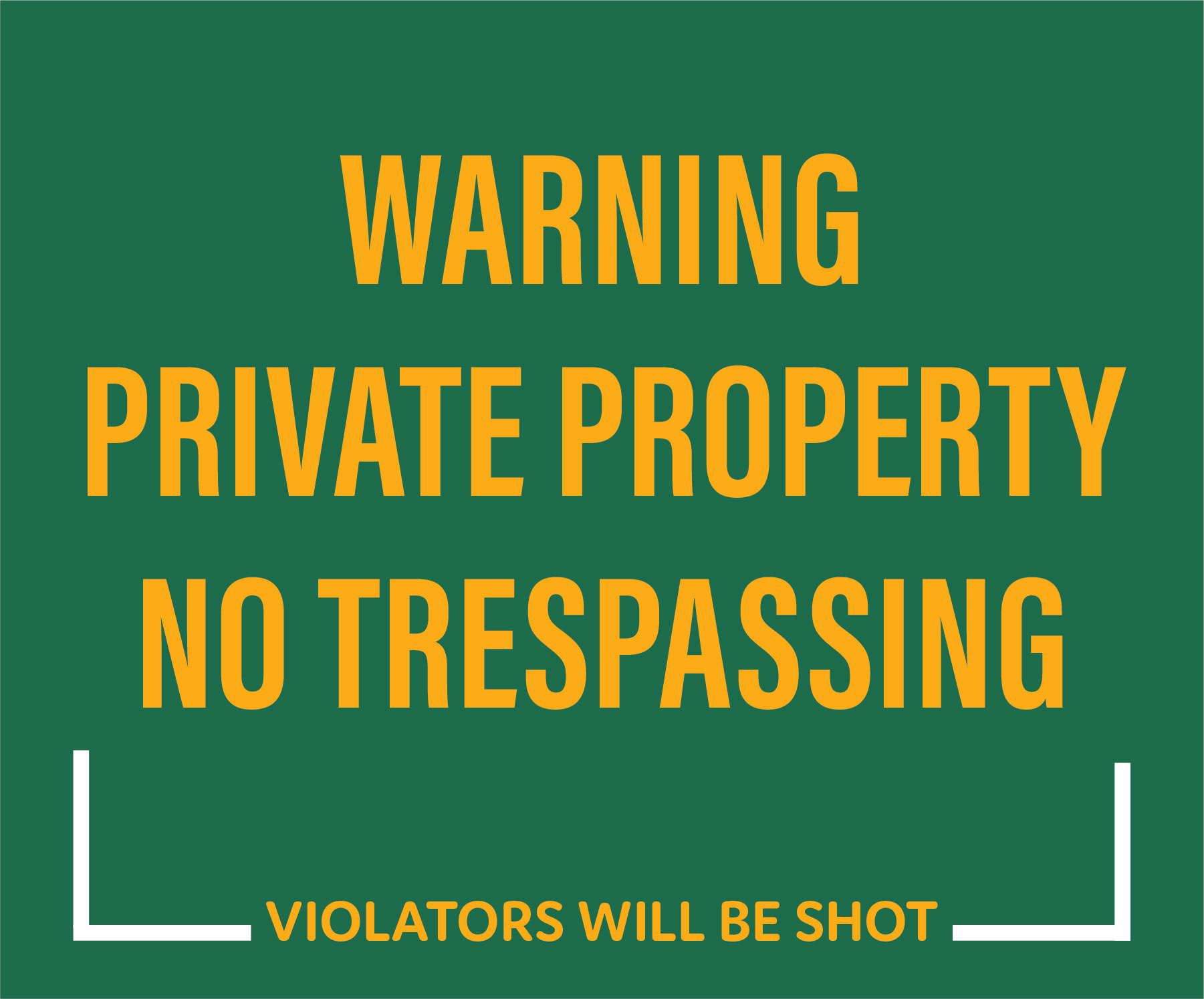
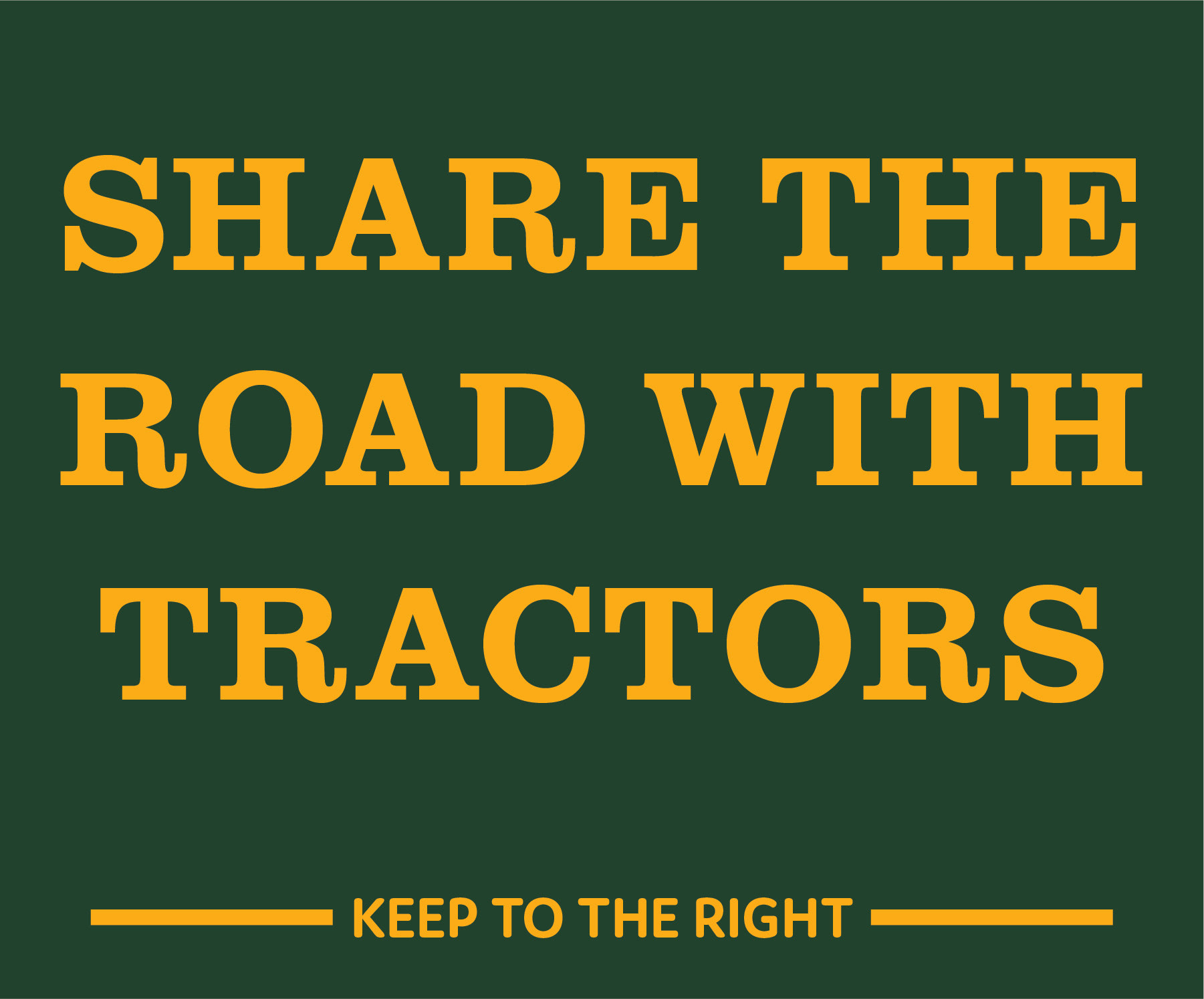
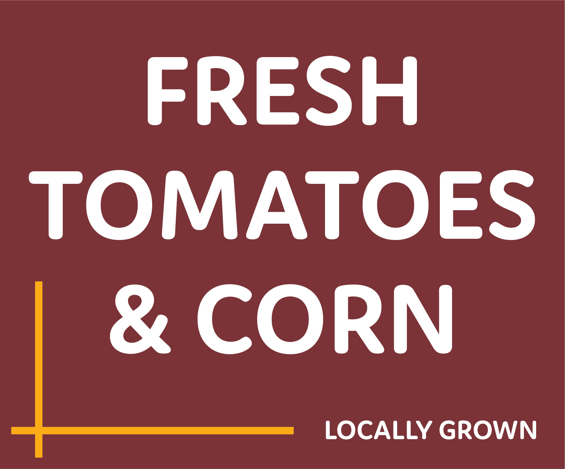
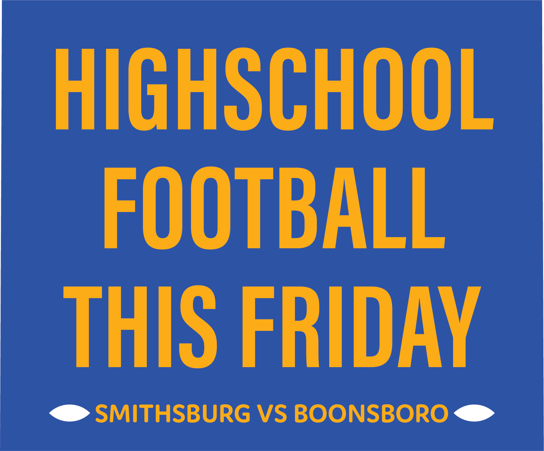
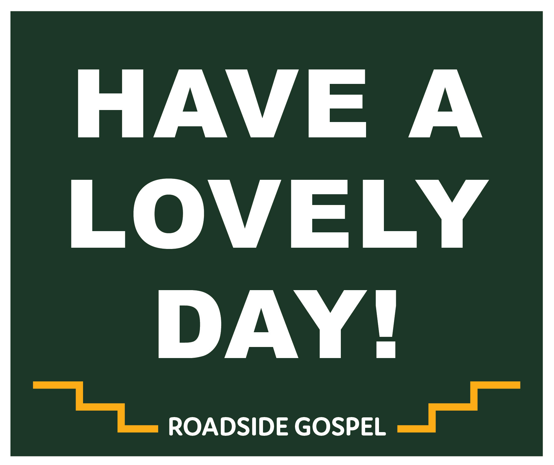
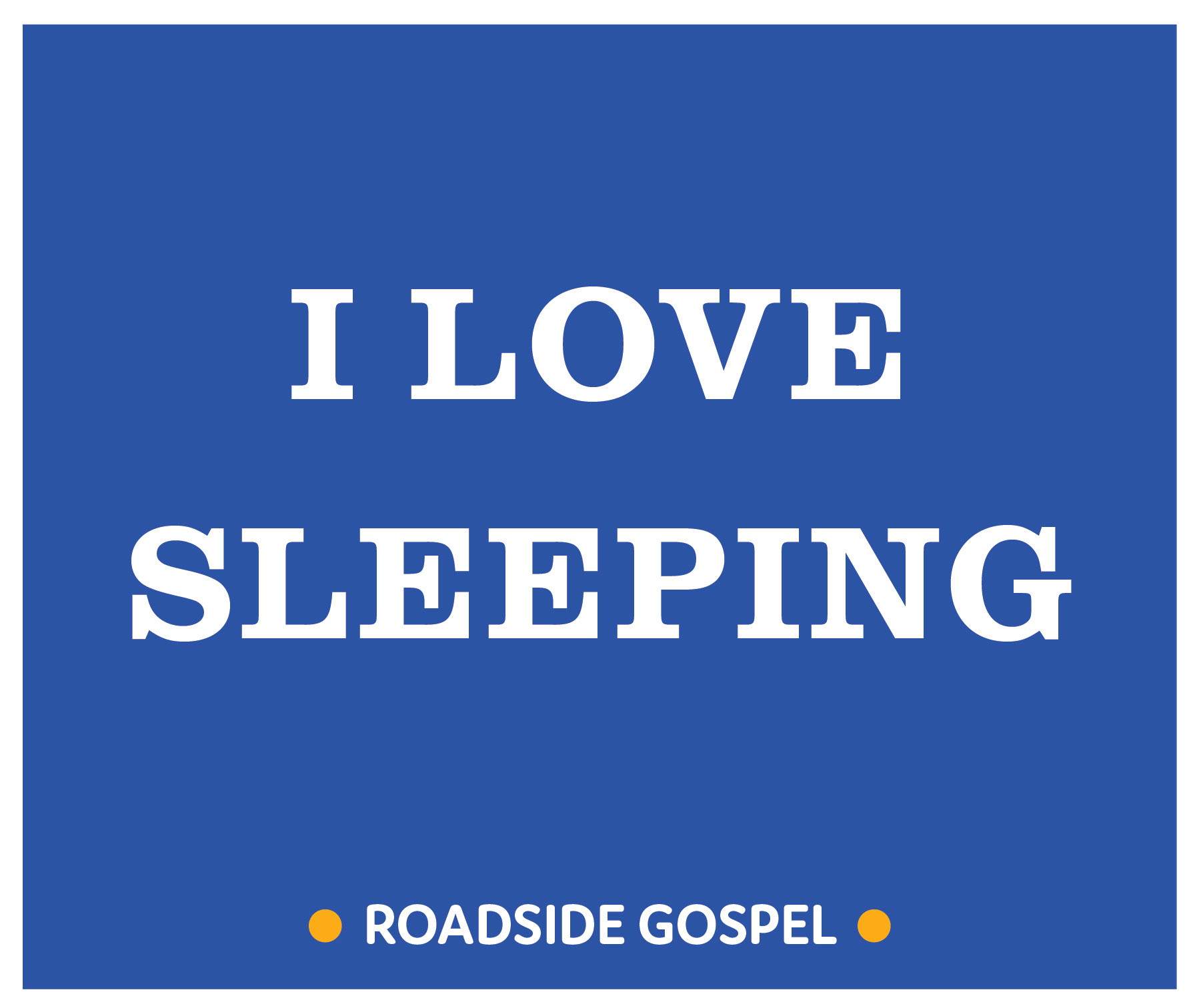
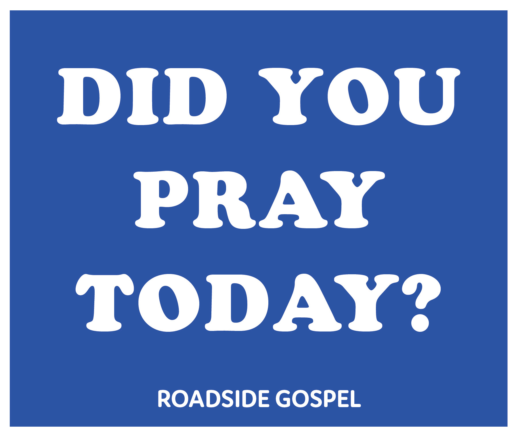
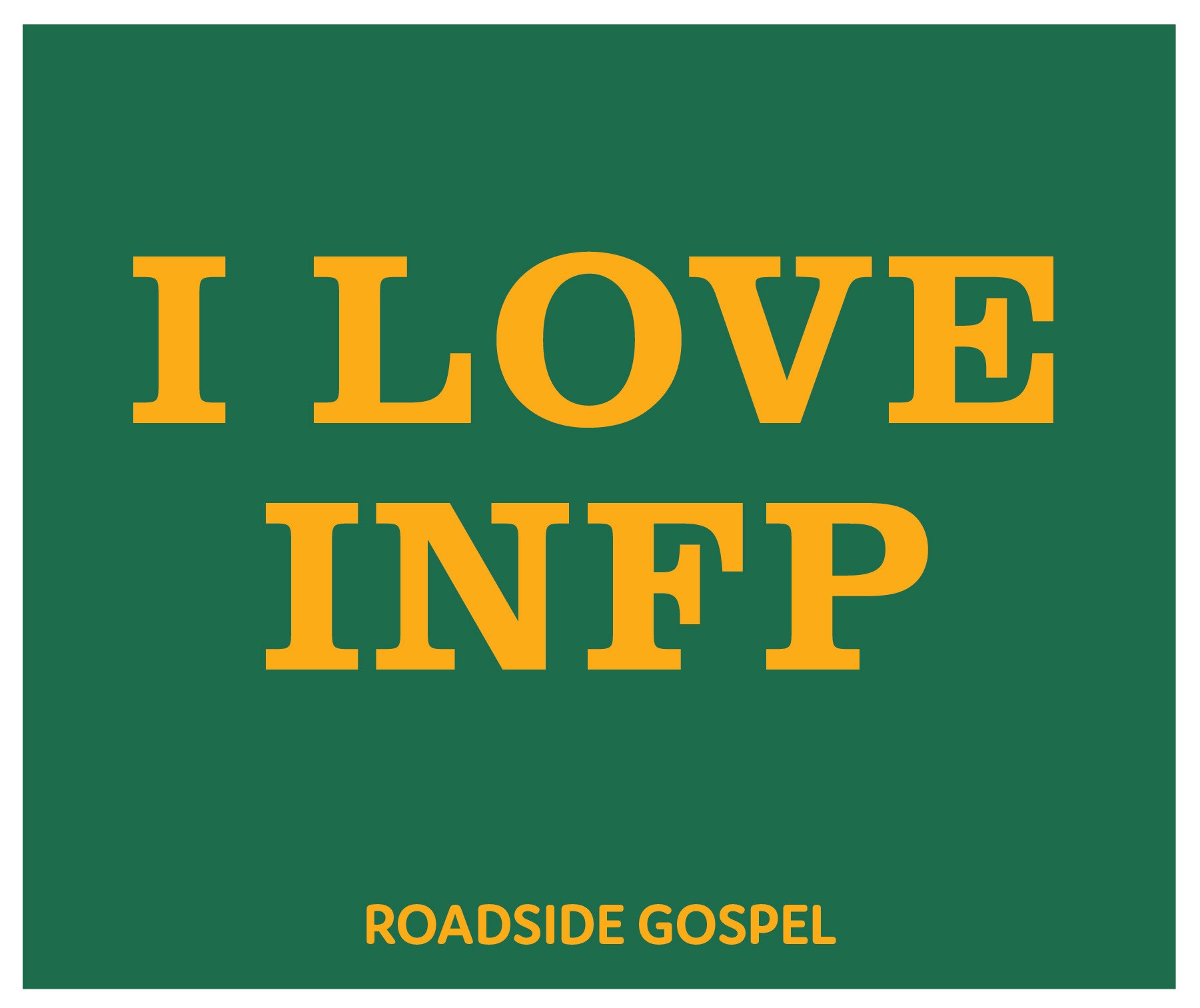
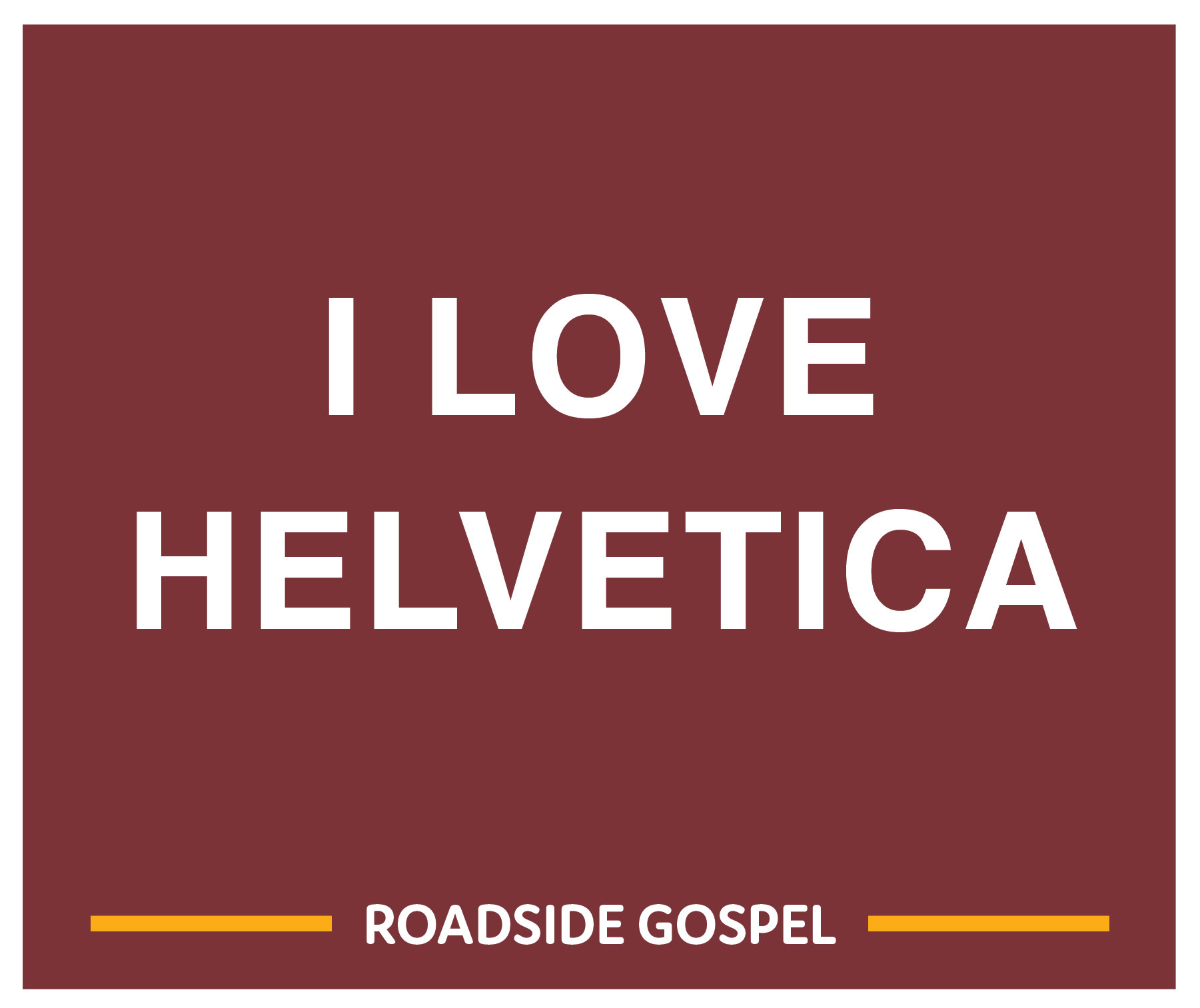
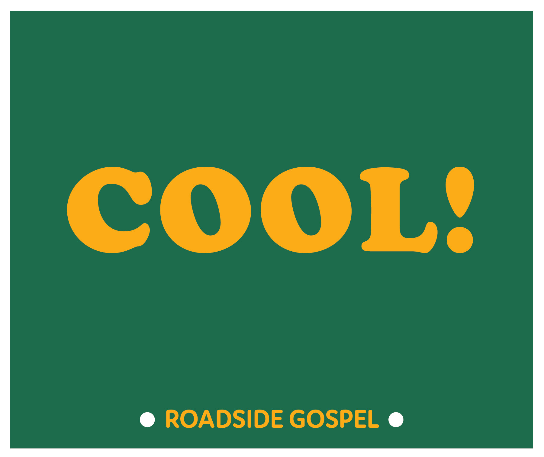
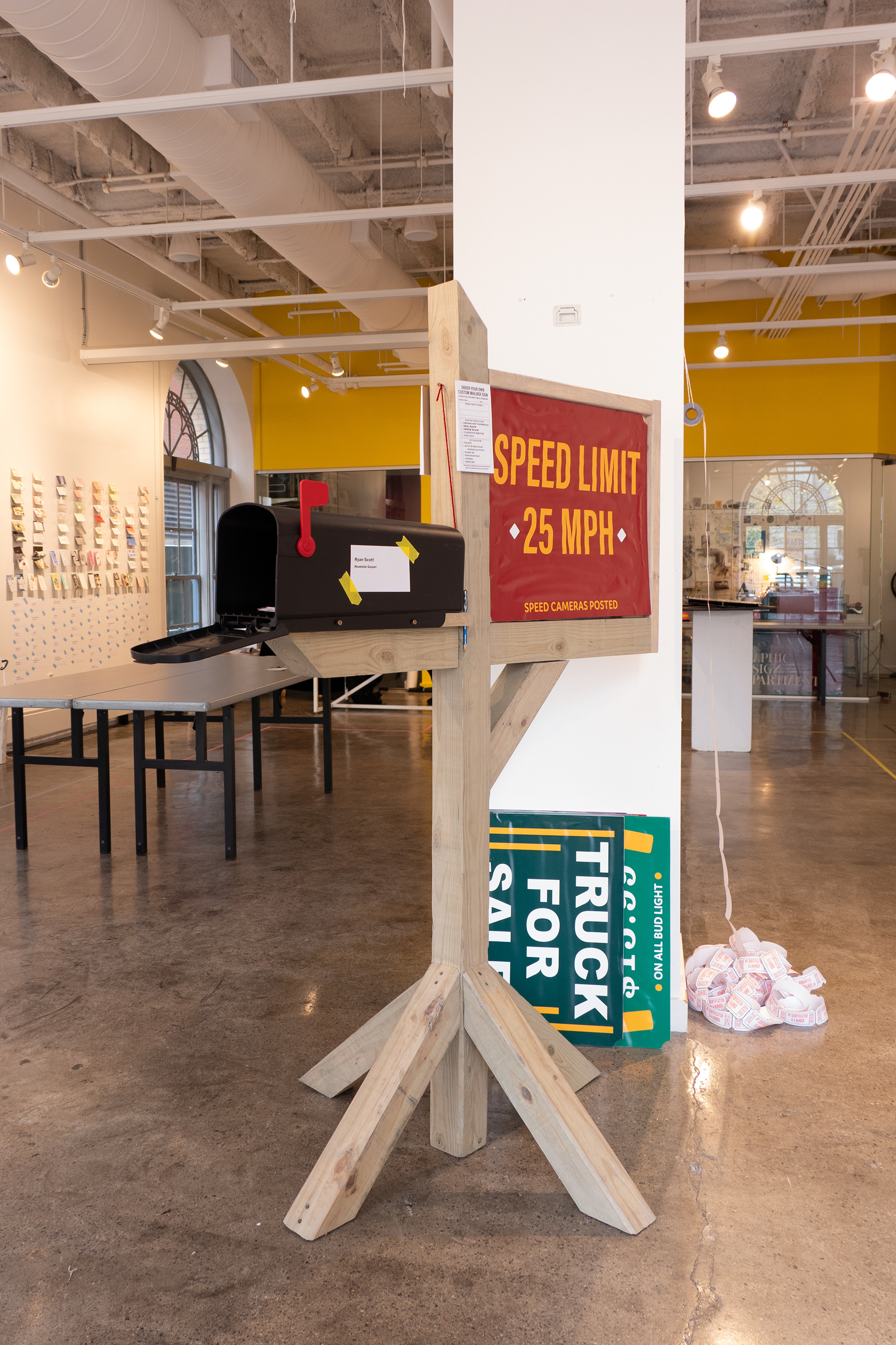
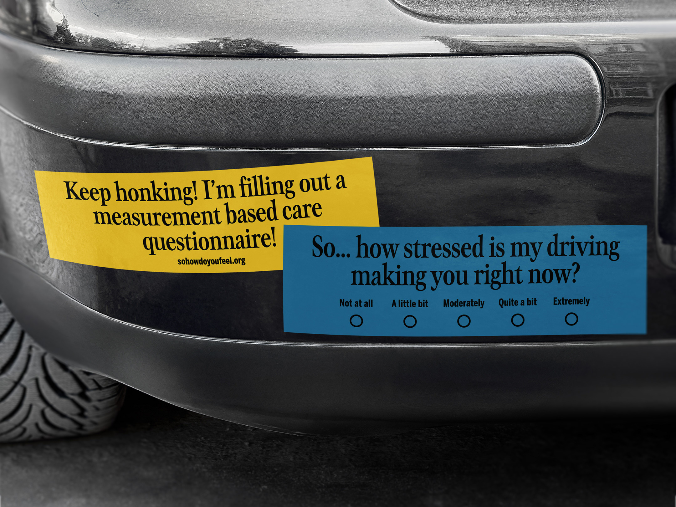
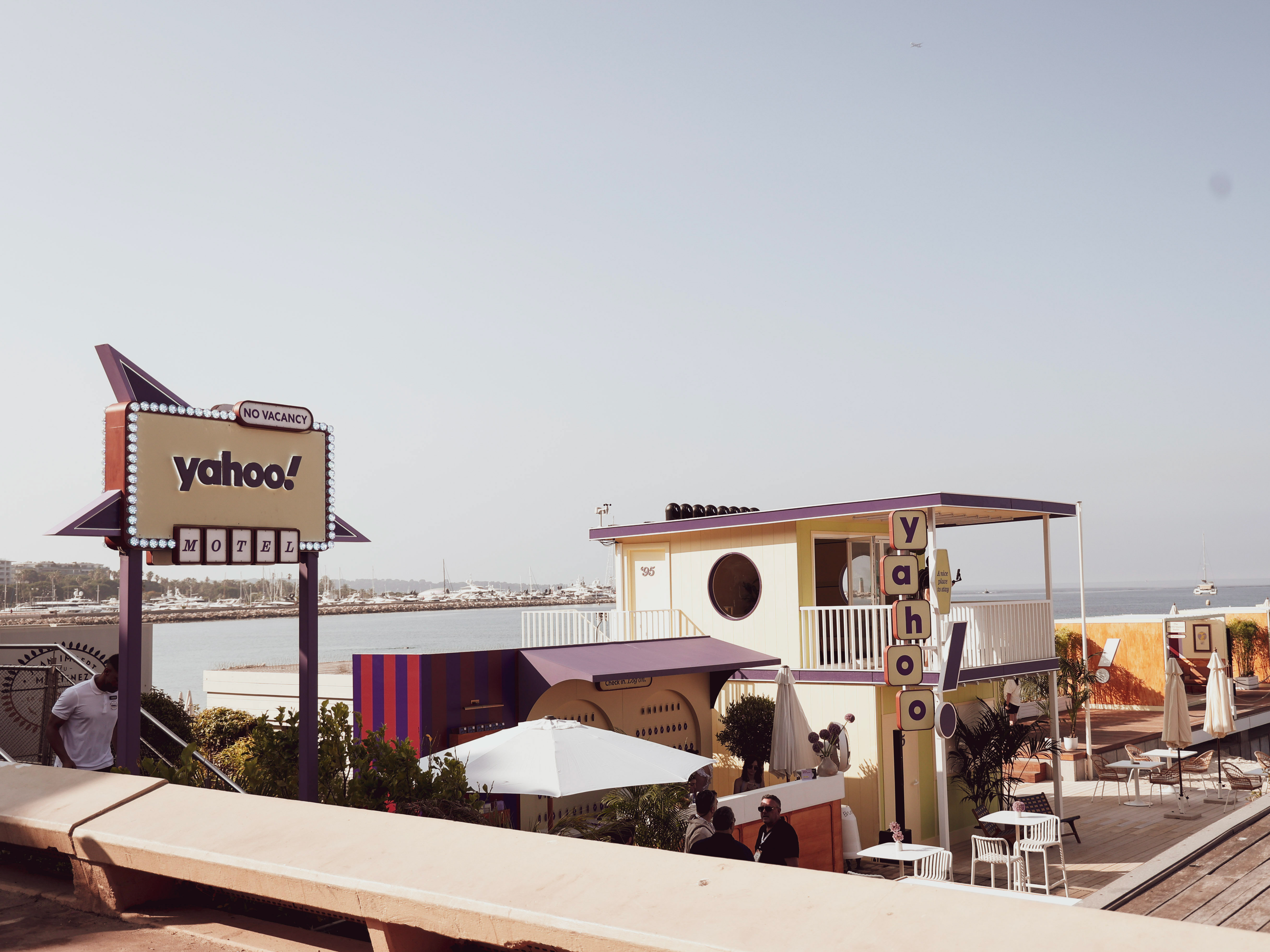
Using the same colors, typefaces, composition, and even building an entire 1:1 recreation of the wooden signs from scratch, my thought process was to take the power small religious communities can have over even smaller towns and give that voice back to those that might not have had a chance to share that space before. These new signs advertise yard sales, local sports games, deals on beer, and parody other signs I’ve seen around my community. Messages about God and damnation become as common as ads for trucks or fresh tomatoes or even speed limit signs.
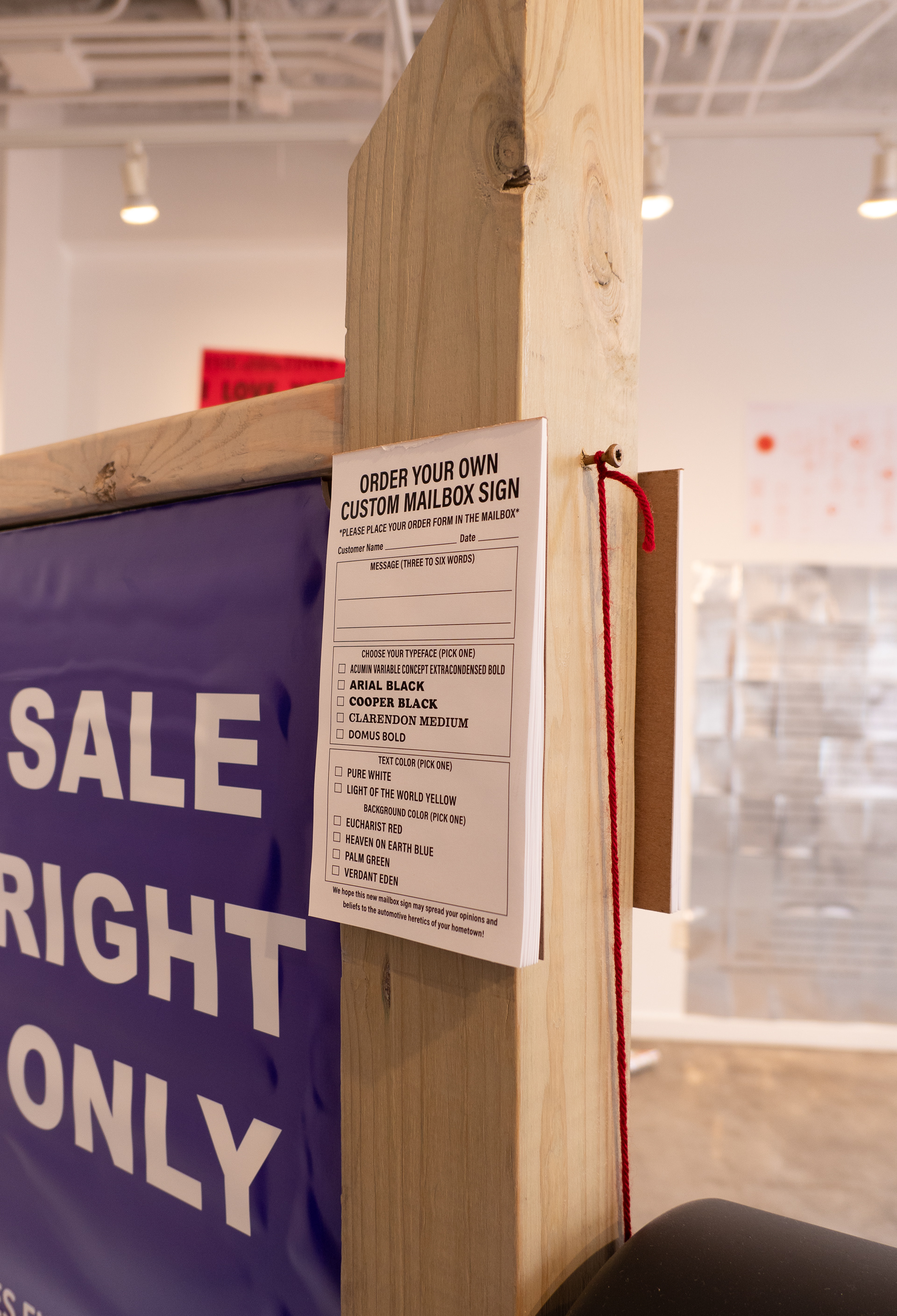
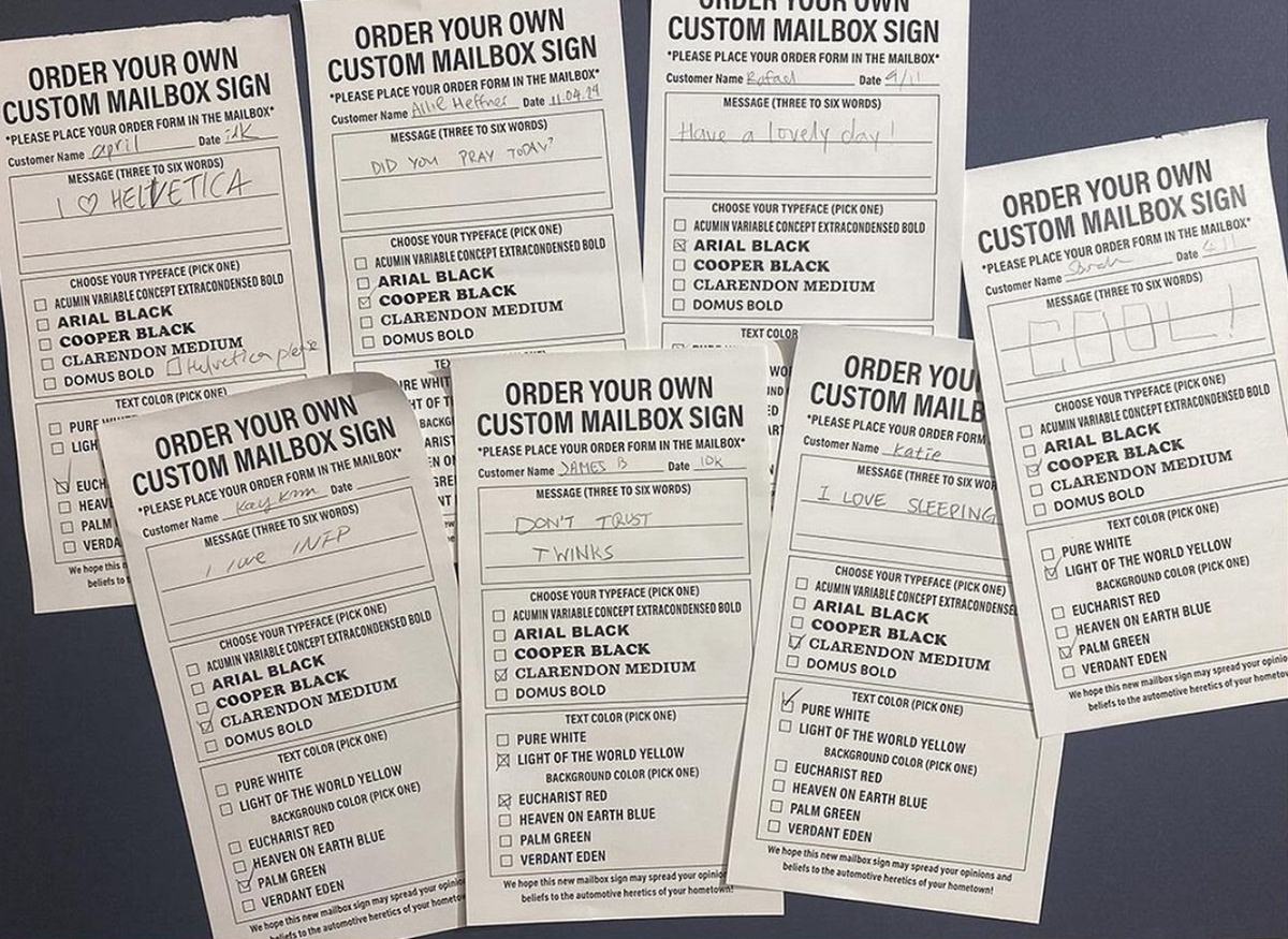
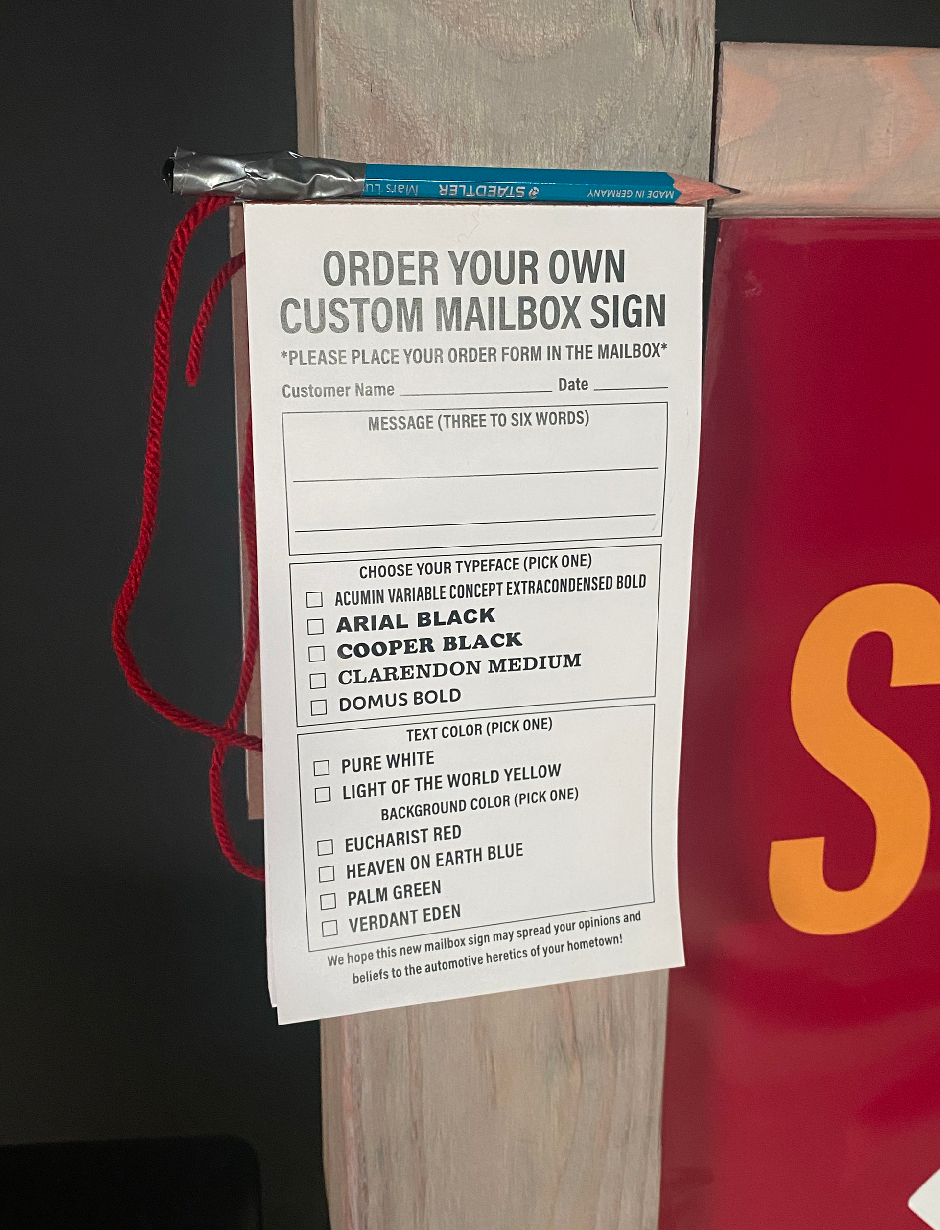
Audience members were also invited to fill out their own order form with their own choice of typeface, color, and personalized message, giving anyone the power to preach their beliefs in the same way as the source material.
Audience members were also invited to fill out their own order form with their own choice of typeface, color, and personalized message, giving anyone the power to preach their beliefs in the same way as the source material.
The signs are also interchangeable, reflecting the monthly rotations the real-life counterparts take, allowing for a wider variety of messages to be shared and chosen by viewers.
